


Survey and Poll Analysis Graphs – Optimized for Market Analysis
RM0900002_15
- Last Update 03/02/2025
- File Size 21MB
- # of Slides 2
- File Format PPTX
- Slide Ratio 16:9
- Color
Keywords
- #Content-Based Slides
- #Design-Based Slides
- #Market and Competitor Analysis
- #Diagram
- #Graph
- #Competitor Analysis
- #Market Analysis
- #Flow
- #Circles
- #Linear Flow
- #Doughnut Chart
- #16:9
- #donut chart PowerPoint slide
- #survey analysis template
- #poll results visualization
- #pie chart alternative
- #market research presentation template
About the Product
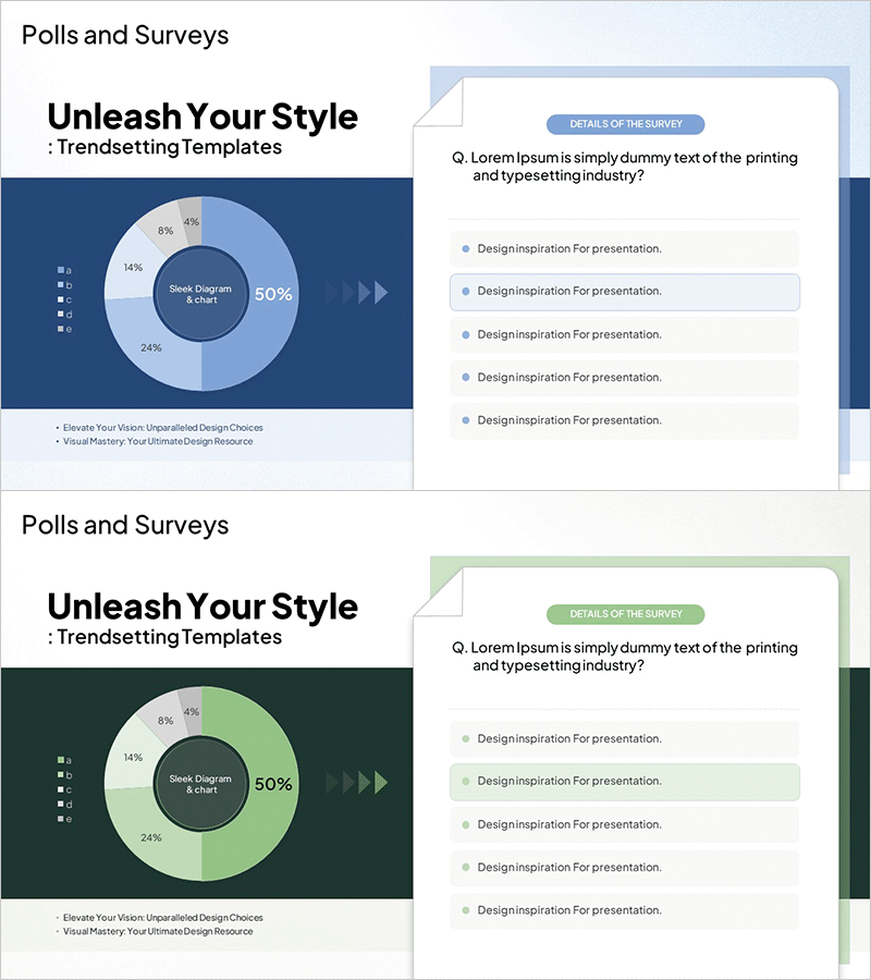
A donut chart PowerPoint slide designed to visualize survey and poll results with clarity and impact. The design emphasizes the central metric (50%) while displaying five surrounding segments representing different response categories (8%, 14%, 24%, 6%, 4%). Built on a dark blue background with light blue gradient tones, the chart creates clear visual hierarchy for data interpretation. The slide includes navigation arrows and a detailed survey question section on the companion slide, making it ideal for market analysis presentations. Delivered in 2-slide PPTX format (16:9 aspect ratio) with full editing capability for customization.
Usage Points
-
Main Usage
Visualize survey response distribution and market research findings using a donut chart format that emphasizes the dominant metric in the center while displaying supporting data segments around the perimeter. This design approach helps audiences quickly grasp the primary insight while maintaining awareness of secondary data points.
-
How to Use
Insert this slide into the 'Research Findings' or 'Market Analysis' section of business reports, investor presentations, or client proposals. The two-slide layout pairs the donut chart visualization with a detailed survey question and response breakdown, allowing you to present both the visual summary and supporting details. Use the navigation arrows to guide audience attention through the data narrative.
-
Recommended For
Marketing professionals, market researchers, business analysts, and data scientists presenting customer preference surveys, brand awareness studies, or market segmentation findings to executives, investors, or stakeholders. Particularly effective for B2B proposals, quarterly business reviews, and academic research presentations where quantitative credibility is essential.
-
Slide Structure
Slide 1: Title area + donut chart with center emphasis (50% core metric) + five surrounding segments (8%, 14%, 24%, 6%, 4%) + legend. Slide 2: Survey question text + five response option explanation boxes (light blue background) + navigation arrows. Dark blue background throughout with light blue gradient accents for visual hierarchy.
Related Products
-
Medical Comparative Analysis Donut Circle Graph – Effective Market Analysis
#Market and Competitor Analysis #Graph #Competitor Analysis
-
Healthcare Analytics Donut Graph – Visualizing Market Insights
#Market and Competitor Analysis #Graph #Competitor Analysis
-
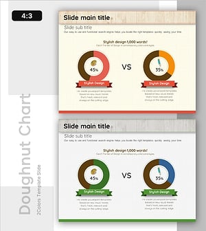
Competitor Comparison Donut Chart – Effective Tool for Market and Competitive Analysis
#Market and Competitor Analysis #Graph #Competitor Analysis
-
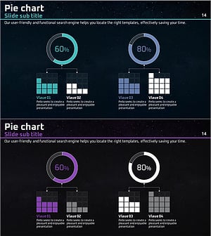
Donut Circle Graph & Cube Graph – Optimized for Market & Competitor Analysis
#Market and Competitor Analysis #Graph #Other