Graph of Industrial Change and Global Market Analysis – Understanding Market Trends
RM0600005_9
- Last Update 02/24/2025
- File Size 0.3MB
- # of Slides 2
- File Format PPTX
- Slide Ratio 16:9
- Color
Keywords
- #Content-Based Slides
- #Design-Based Slides
- #Market and Competitor Analysis
- #Diagram
- #Graph
- #Market Analysis
- #Industry Trends
- #Cluster
- #Line
- #Closed Cluster Diagram
- #Line Chart
- #16:9
- #line chart PowerPoint slide
- #market trend analysis presentation
- #multi-series data visualization
- #industrial change slide template
- #business analytics PowerPoint
About the Product
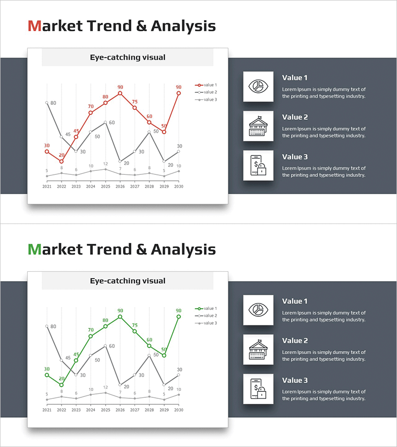
A multi-series line chart PowerPoint slide designed to visualize industrial change and global market trends over time. This presentation template displays data from 2021 to 2030 across three distinct data series, using red, black, and gray color coding for clear visual differentiation. The layout combines a comprehensive chart area on the left with icon-based information boxes on the right, making it ideal for business reports, market analysis presentations, and executive briefings. Provided in 16:9 PPTX format for seamless integration into your presentation workflow.
Usage Points
-
Main Usage
Effectively compare and analyze changes in market indicators over time using multiple data series. Ideal for presenting industry trend analysis, business performance reports, market research findings, and competitive landscape assessments where temporal data patterns are critical to understanding.
-
How to Use
Input your actual data into the left-side chart to represent each series trend. Enhance the right-side icon section with key metric labels and supporting descriptions. Deploy across executive presentations, investor briefings, market analysis seminars, and strategic planning sessions to communicate data-driven insights.
-
Recommended For
Recommended for executives, business analysts, marketing strategists, sales leaders, management consultants, and data professionals. Particularly effective for market research presentations, business performance analysis, competitive benchmarking, industry trend discussions, and quarterly business reviews.
-
Slide Structure
Two-slide deck featuring a left-aligned multi-series line chart with three color-coded trends (10 data points each: red, black, gray) and a right-aligned information panel with three icon-labeled value boxes. Includes title area, legend, and axis labels for complete data context and interpretation.
Related Products
-

Line Charts for Living Conditions – Visualizing Market Analysis
#Market and Competitor Analysis #Diagram #Graph
-

Mobile Market Analysis Bar & Line Charts – Trend Visualization
#Market and Competitor Analysis #Graph #Market Analysis
-

Competitor Market Analysis Broken Line Graph – Enhance Business Strategy with Data Visualization
#Market and Competitor Analysis #Diagram #Graph
-

City Background Broken Line Graph – Market Trend Analysis
#Market and Competitor Analysis #Graph #Market Analysis
