Typographic Wide Template Line Chart – Effective Data Visualization for Market Analysis
RJ0200047_28
- Last Update 04/11/2025
- File Size 0.2MB
- # of Slides 2
- File Format PPTX
- Slide Ratio 16:9
- Color
Keywords
- #Content-Based Slides
- #Design-Based Slides
- #Market and Competitor Analysis
- #Diagram
- #Graph
- #Competitor Analysis
- #Industry Trends
- #Cluster
- #Line
- #Closed Cluster Diagram
- #Line Chart
- #16:9
- #line chart PowerPoint
- #multi-series chart template
- #trend comparison slide
- #market analysis data visualization
- #competitive analysis PPT template
About the Product
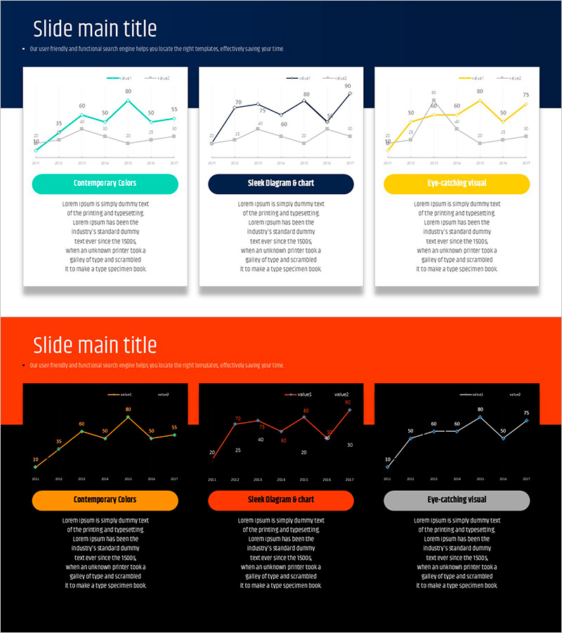
A professional line chart PowerPoint slide optimized for market analysis and competitive comparison. This presentation template visualizes three data series simultaneously, enabling clear representation of trend changes and performance comparisons. The slide uses teal, navy, and yellow color schemes to distinguish each series, with data points and numerical labels for precise information delivery. Formatted in 16:9 widescreen with 2 slides, it allows immediate editing and data input. Ideal for business reports, marketing analysis presentations, financial updates, and strategic planning decks.
Usage Points
-
Main Usage
Compares multiple indicators' time-based trends simultaneously. Displays three or more data series as line graphs to reveal correlations and pattern changes in sales volume, market share, customer satisfaction, and other metrics at a glance.
-
How to Use
Input each series' data points into the slide's coordinate axes and the line graph automatically connects them. Modify legend and axis labels to match your analysis topic, and adjust colors easily. During presentation, use mouse pointer to highlight specific data points and draw audience attention to key insights.
-
Recommended For
Executives, marketing teams, sales departments, analysts, and consultants presenting quarterly or annual performance comparisons, market trend analysis, and competitive benchmarking. Particularly effective in financial reports, business plans, and marketing proposals that require data-driven decision support.
-
Slide Structure
Consists of 2 slides, each containing a 3-series line graph. X-axis represents time or categories, Y-axis shows numerical values, and each data point displays numerical labels. Dedicated legend and title areas allow easy information addition and customization.
Related Products
-

Social Network Market Competitor Analysis PPT – Data Driven Competitive Advantage
#Market and Competitor Analysis #Diagram #Graph
-

Mobile Service Technology Analysis Graph – Market and Competitor Analysis
#Market and Competitor Analysis #Diagram #Graph
-

Graph of Usage Patterns by Year – Visualizing Market Conditions through Cluster Slides
#Market and Competitor Analysis #Diagram #Graph
-

Market Trend Line Comparison Analysis Chart
#Market and Competitor Analysis #Graph #Competitor Analysis
