Dividend Yield & Stock Price Growth Rate Analysis Graph
RM0600005_27
- Last Update 02/24/2025
- File Size 0.4MB
- # of Slides 2
- File Format PPTX
- Slide Ratio 16:9
- Color
Keywords
- #Content-Based Slides
- #Design-Based Slides
- #Market and Competitor Analysis
- #Financial Plans and Performance
- #Diagram
- #Graph
- #Other
- #Competitor Analysis
- #Projected Return on Investment (ROI)
- #Cluster
- #Closed Cluster Diagram
- #16:9
- #dividend yield chart PowerPoint
- #stock price growth analysis slides
- #combination chart template
- #line bar graph presentation
- #investment return visualization
- #financial analysis PowerPoint
About the Product
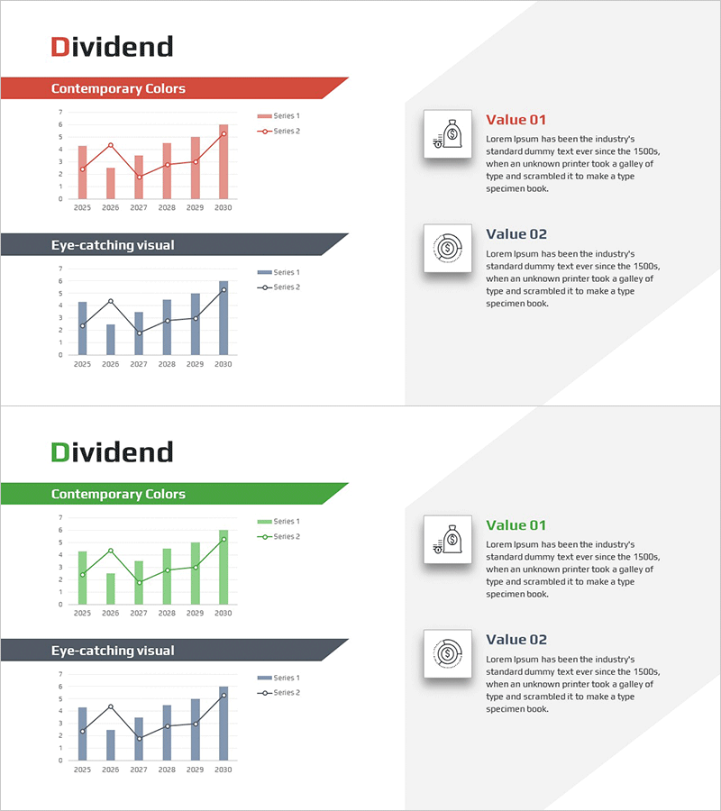
A 2-slide PowerPoint presentation combining line and bar charts to compare dividend yield and stock price growth rate side by side. The hybrid chart visualizes two data series using red and blue color schemes to clearly distinguish between the two metrics. Spanning 2025–2030, this slide template is ready for immediate use in investment return analysis, financial planning, and competitive benchmarking presentations. Delivered in 16:9 widescreen PPTX format, fully editable across all presentation software platforms.
Usage Points
-
Main Usage
Simultaneously compare two key metrics—dividend yield (bar) and stock price growth (line)—to demonstrate comprehensive investment performance and persuade stakeholders. Ideal for financial strategy, investment planning, and competitive analysis presentations to executives and investors.
-
How to Use
Slide 1 features a red-toned Contemporary Colors background suitable for formal executive and investor presentations. Slide 2 uses a blue Eye-catching visual design for analytical reports and internal meetings. Simply double-click the data values in each chart to replace them with your actual figures.
-
Recommended For
Finance teams, investment analysts, fund managers, securities research departments, and C-suite executives presenting dividend policy, stock performance, and investment returns. Essential for quarterly earnings calls, investor relations meetings, executive briefings, and strategic business planning sessions.
-
Slide Structure
2-slide layout. Each slide contains a title banner area (Contemporary Colors or Eye-catching visual) and a chart section below. The chart displays 6 years (2025–2030) on the X-axis, 0–7 scale on Y-axis, with red bars (Series 1) and black line (Series 2) representing dual data series. Right-side Value 01 and Value 02 text boxes allow supplementary annotations.
Related Products
-

Dividend Analysis Chart & Dividend Policy – Insights into Market and Performance
#Market and Competitor Analysis #Financial Plans and Performance #Diagram
-

Business Program Analysis Area Graph – Competitive Edge
#Market and Competitor Analysis #Diagram #Graph
-

Dividend Yield Comparison Analysis Chart – Visualizing Investment Performance
#Market and Competitor Analysis #Financial Plans and Performance #Graph
-

Sales Activity Comparison Graph - Market and Competitor Analysis
#Market and Competitor Analysis #Financial Plans and Performance #Graph
