Business Program Analysis Area Graph – Competitive Edge
RJ0300068_25
- Last Update 05/07/2025
- File Size 1.4MB
- # of Slides 2
- File Format PPTX
- Slide Ratio 16:9
- Color
Keywords
- #Content-Based Slides
- #Design-Based Slides
- #Market and Competitor Analysis
- #Diagram
- #Graph
- #Other
- #Competitor Analysis
- #Competitive Advantage
- #Cluster
- #Closed Cluster Diagram
- #16:9
- #area chart PowerPoint
- #area graph template
- #cumulative trend visualization
- #business performance slide
- #multi-series area chart PowerPoint
About the Product
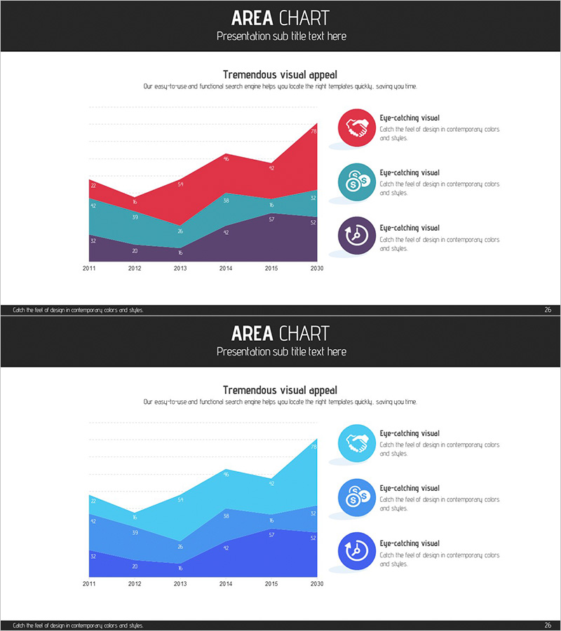
A three-series area chart PowerPoint slide designed to compare and analyze business program performance changes over time. The slide visualizes data from 2011 to 2030 using three distinct color layers—red, teal, and deep purple—allowing viewers to understand cumulative trends and relative proportions at a glance. A legend with icon-based markers on the right side provides intuitive identification of each data series. This presentation slide is ready to use for competitive analysis, team performance comparison, business segment revenue trends, and various other business scenarios.
Usage Points
-
Main Usage
This slide is designed to display multiple data series' cumulative trends and relative proportions simultaneously over time. It is particularly effective for showing business segment revenue changes, product category sales trends, team performance comparisons, and other scenarios where layered data visualization is needed.
-
How to Use
Input your actual data into the X-axis (years) and Y-axis (values), and the chart automatically renders in area form. Each series color can be freely customized, and legend text can be modified to match your analysis categories. During presentation, emphasizing each series' trajectory and intersection points will enhance audience comprehension.
-
Recommended For
Recommended for executive reports analyzing past performance and presenting future projections during business strategy planning, investor presentations, team performance review meetings, and marketing strategy presentations. Particularly valuable for companies with multiple business divisions or product lines analyzing their portfolio performance.
-
Slide Structure
Two-slide set, each featuring a three-series area chart as the focal point. The first slide presents the standard version with red, teal, and deep purple color layers. The second slide offers a lighter tone variant with light blue, sky blue, and navy blue, allowing selection based on presentation environment and corporate branding. Each slide includes three circular icon markers positioned on the right as legend elements.
Related Products
-

Vertical Bar Chart Slide for Business Competitive Advantage Analysis
#Market and Competitor Analysis #Graph #Other
-

Dividend Analysis Chart & Dividend Policy – Insights into Market and Performance
#Market and Competitor Analysis #Financial Plans and Performance #Diagram
-

Competitive Comparison Area Diagram – Visualizing Market Advantage
#Market and Competitor Analysis #Graph #Other
-

Social Network Market Competitor Analysis PPT – Data Driven Competitive Advantage
#Market and Competitor Analysis #Diagram #Graph
