Dividend Analysis Chart & Dividend Policy – Insights into Market and Performance
RM0600004_27
- Last Update 02/24/2025
- File Size 0.3MB
- # of Slides 2
- File Format PPTX
- Slide Ratio 16:9
- Color
Keywords
- #Content-Based Slides
- #Design-Based Slides
- #Market and Competitor Analysis
- #Financial Plans and Performance
- #Diagram
- #Graph
- #Other
- #Competitor Analysis
- #Projected Return on Investment (ROI)
- #Cluster
- #Closed Cluster Diagram
- #16:9
- #dividend chart PowerPoint
- #dual-axis graph slide
- #dividend payout ratio analysis
- #financial analysis chart
- #dividend policy presentation
- #investor relations slide
About the Product
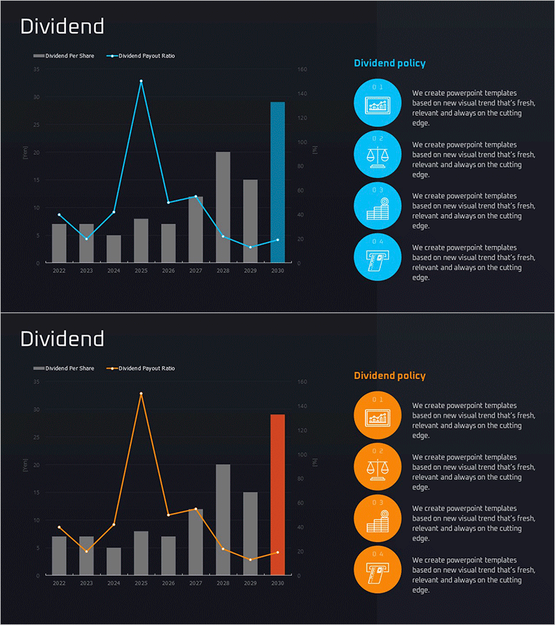
A dual-axis PowerPoint slide that visualizes dividend per share and dividend payout ratio side by side. This presentation combines a bar chart and line graph to compare annual dividend amounts and payout ratios at a glance. Set against a dark background with blue and orange accent colors, it's designed for financial reports and investor presentations. The right side features four circular icon text boxes that illustrate dividend policy, emphasizing key messages. With two slide variations (blue and orange), you can instantly adapt the design to match your corporate brand guidelines.
Usage Points
-
Main Usage
This financial analysis slide simultaneously visualizes year-over-year dividend growth and payout ratio trends, demonstrating dividend policy consistency and shareholder value creation. It serves as a key supporting document for investor relations presentations, shareholder meetings, and annual financial reports when explaining dividend strategy.
-
How to Use
Input actual dividend data (bar chart) and payout ratio percentages (line graph) on the left side to show annual trends. Fill the four circular icon text boxes on the right with core dividend policy principles (e.g., stable dividends, shareholder returns, growth investment, financial soundness). Select either the blue or orange color version to align with your corporate brand identity.
-
Recommended For
CFOs, financial officers, and investor relations professionals presenting dividend policy and shareholder return strategies at shareholder meetings, institutional investor briefings, and analyst meetings. Particularly suitable for dividend-focused companies in finance, insurance, energy, and utilities sectors.
-
Slide Structure
Two-slide set. Each slide features a dual-axis chart on the left (8–10 year bar graph plus one line series for payout ratio) and four circular icon text boxes arranged vertically on the right. Includes title area, legend (Dividend Per Share and Dividend Payout Ratio), and axis labels. Two color variations provided: blue and orange versions.
Related Products
-

Dividend Yield & Stock Price Growth Rate Analysis Graph
#Market and Competitor Analysis #Financial Plans and Performance #Diagram
-

Sales Activity Comparison Graph - Market and Competitor Analysis
#Market and Competitor Analysis #Financial Plans and Performance #Graph
-

Dividend Analysis Graph for the Last 6 Years – Financial Performance Insights
#Market and Competitor Analysis #Financial Plans and Performance #Graph
-

Spaceship Launch Analysis Graph – Ideal for Competitor Analysis
#Market and Competitor Analysis #Diagram #Graph
