Market Trend Analysis Diagram – Effective Material for Strategy Development
RM0600004_9
- Last Update 02/24/2025
- File Size 0.3MB
- # of Slides 2
- File Format PPTX
- Slide Ratio 16:9
- Color
Keywords
- #Content-Based Slides
- #Design-Based Slides
- #Market and Competitor Analysis
- #Diagram
- #Graph
- #Market Analysis
- #Industry Trends
- #Flow
- #Horizontal Bar
- #Linear Flow
- #Horizontal Bar Chart
- #16:9
- #market analysis diagram PowerPoint
- #business strategy presentation slides
- #bar chart donut chart PPT
- #market trend analysis template
- #data visualization slide design
About the Product
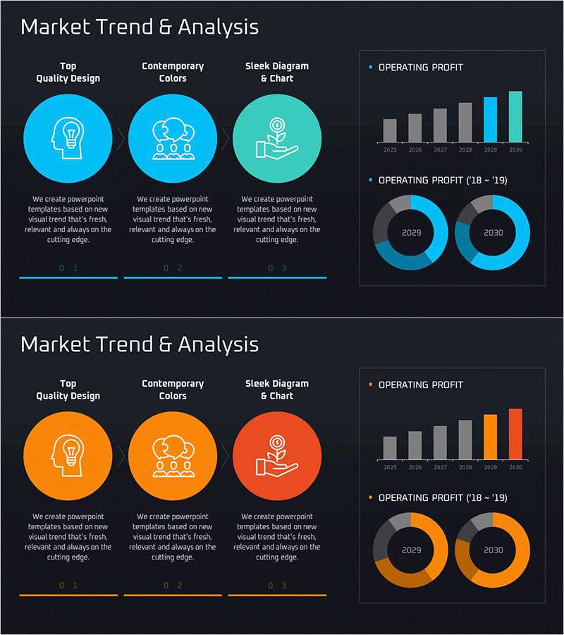
A 2-slide PowerPoint presentation set designed for business strategy and market analysis presentations. Features three circular icon diagrams on the left (innovation design, contemporary colors, sleek chart) paired with bar graphs and donut charts on the right. Available in both blue and orange color schemes, each slide is in 16:9 PPTX format and fully editable. Perfect for executive reports, strategic planning meetings, and marketing presentations requiring data visualization and clear message delivery.
Usage Points
-
Main Usage
Effectively communicate market trends and performance data in executive reports, strategy meetings, and marketing presentations through visual diagrams. The three circular icons emphasize innovation, trend awareness, and efficiency, while the graphs clearly display year-over-year performance metrics and compositional ratios.
-
How to Use
Input company core values, strategic focus points, or competitive differentiators in the three circular icon areas on the left. Add quantitative data such as annual revenue or growth rates to the bar graph, and insert business segment or product category percentages in the donut charts. Select either the blue or orange color version to match your corporate brand identity.
-
Recommended For
Ideal for executives, business managers, and marketing teams presenting quarterly or annual performance reports, market analysis findings, and strategic planning initiatives. Particularly effective for executive-level presentations where both quantitative data and qualitative messaging must be conveyed simultaneously to build credibility and persuasiveness.
-
Slide Structure
Slide 1: Left side features 3 circular icons (lightbulb, collaboration, hand gesture) with text areas below each; right side displays 6-year bar graph (2025–2030) with two donut charts for 2029 and 2030. Slide 2: Identical layout in orange color scheme. All text, numerical values, and colors are fully editable.
Related Products
-

Latest Trend Analysis Bar & Donut Charts
#Market and Competitor Analysis #Graph #Market Analysis
-

Market Trend Analysis Chart – Effective Data Visualization
#Market and Competitor Analysis #Graph #Market Analysis
-

Chart of Industry Change and Global Market Outlook Analysis
#Market and Competitor Analysis #Graph #Market Analysis
-

Service Market Trends and Analysis Slide (Red and Blue)
#Market and Competitor Analysis #Diagram #Graph
