Experimental Analysis Graph – Insights through Data Visualization
RJ0700026_19
- Last Update 07/29/2025
- File Size 0.2MB
- # of Slides 2
- File Format PPTX
- Slide Ratio 16:9
- Color
Keywords
- #Content-Based Slides
- #Design-Based Slides
- #Technical Approach
- #Market and Competitor Analysis
- #Diagram
- #Graph
- #Research and Development
- #Competitor Analysis
- #Cluster
- #Line
- #Closed Cluster Diagram
- #Line Chart
- #16:9
- #line graph PowerPoint
- #dual-series chart slide
- #data trend visualization
- #time-series PowerPoint template
- #how to create line graph in PowerPoint
About the Product
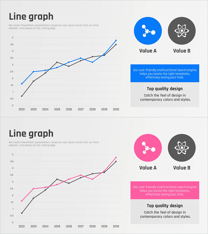
A dual-series line graph PowerPoint slide comparing data trends from 2022 to 2030 with blue and black lines representing two distinct data sets. Each slide features Value A and Value B circular icons with descriptive text boxes to enhance presentation context. The slide design supports technical analysis, market trend visualization, and experimental result comparisons. Immediately applicable to various business presentations, research reports, and performance analysis decks.
Usage Points
-
Main Usage
Visualizes and compares two data series over time from 2022 to 2030. Ideal for presenting technology performance metrics, market share evolution, experimental results, revenue trends, and quantitative analysis in a clear, comparative format.
-
How to Use
Modify Y-axis values and X-axis years to match your data. Change line colors from blue and black to your corporate brand colors. Replace Value A and Value B labels with actual metric names. All elements are fully editable for immediate presentation use.
-
Recommended For
Technology and R&D departments presenting experimental results, marketing teams analyzing market data, executive-level performance presentations, academic conferences, and research institutions. Suitable for any data-driven business presentation requiring comparative trend analysis.
-
Slide Structure
Two-slide set. Each slide contains a title area, dual-series line graph with 8 data points spanning 2022–2030, circular Value A and Value B icons in the upper right, and a description text box (blue highlight box plus gray explanation area) in the lower right.
Related Products
-

Competitor Market Analysis Broken Line Graph – Enhance Business Strategy with Data Visualization
#Market and Competitor Analysis #Diagram #Graph
-

Social Network Market Competitor Analysis PPT – Data Driven Competitive Advantage
#Market and Competitor Analysis #Diagram #Graph
-

Graph of Usage Patterns by Year – Visualizing Market Conditions through Cluster Slides
#Market and Competitor Analysis #Diagram #Graph
-

Competitor Analysis Broken Line Graph – Visualizing Market Trends
#Market and Competitor Analysis #Diagram #Graph
