



Service Analysis Line Graph – Visualization of Competitive Advantage
RJ0300068_14
- Last Update 05/07/2025
- File Size 1.4MB
- # of Slides 2
- File Format PPTX
- Slide Ratio 16:9
- Color
Keywords
- #Content-Based Slides
- #Design-Based Slides
- #Market and Competitor Analysis
- #Diagram
- #Graph
- #Competitor Analysis
- #Competitive Advantage
- #Cluster
- #Line
- #Closed Cluster Diagram
- #Line Chart
- #16:9
- #line chart PowerPoint slide
- #trend analysis presentation template
- #3-series line graph
- #competitive comparison chart
- #service analysis PPT download
About the Product
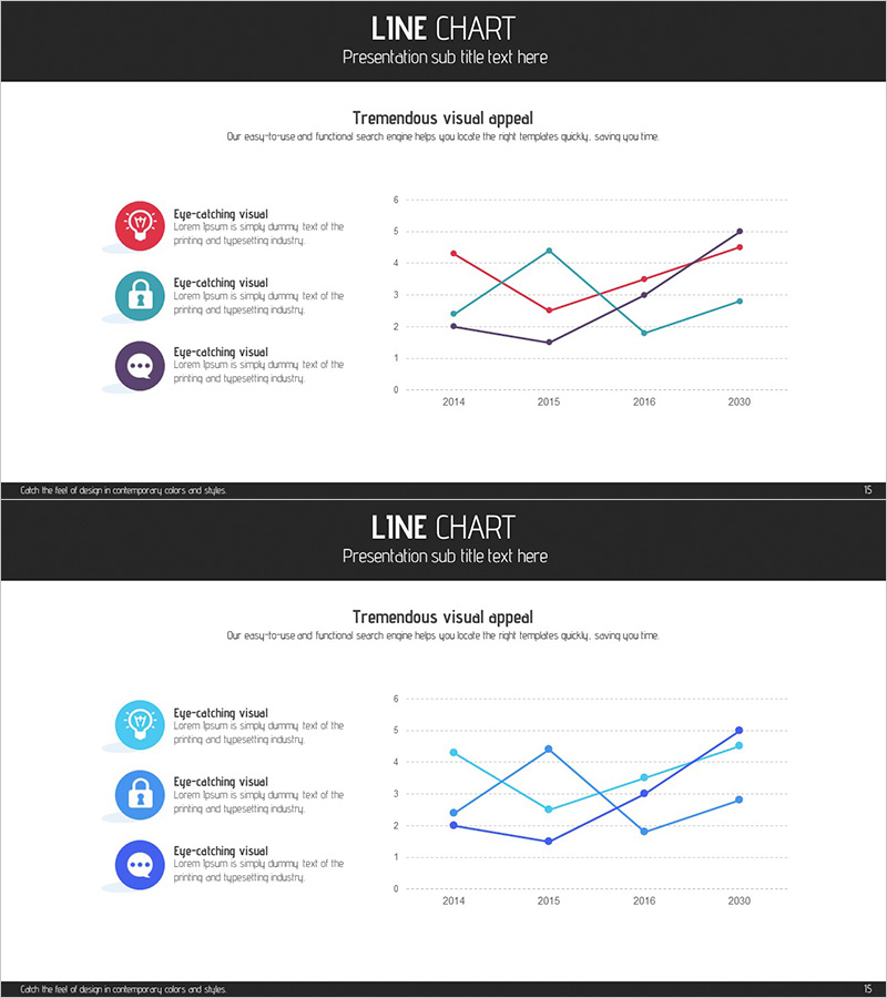
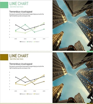
A PowerPoint line chart slide designed for service analysis and competitive benchmarking. Three data series in red, teal, and purple intersect across four years (2014, 2015, 2016, 2030), visualizing performance trends. Three icons (diamond, lock, chat) on the left with descriptive text clarify each series' meaning. Dotted grid background ensures easy value reading, while black header and white content area create clear information hierarchy for professional presentations.
Usage Points
-
Main Usage
Compare multiple metrics over time—market share, customer satisfaction, revenue trends—across competitors or business units. Ideal for benchmarking analysis, performance reporting, and strategic decision-making presentations.
-
How to Use
Replace the three left icons with your analysis categories and update legend text. Input your data values into the chart. Line colors and point styles can remain as-is or be customized to match your brand colors.
-
Recommended For
Executive reports, business plans, marketing strategies, investor pitch decks, quarterly and annual performance reviews. Recommended for consulting, finance, IT, and manufacturing sectors requiring data-driven decision support.
-
Slide Structure
Header (black background with title), content area (white background), left legend (3 icons + descriptive text), right chart (Y-axis 0–6, X-axis 2014–2030, 3 intersecting lines, dotted grid) across 2 slides.
Related Products
-
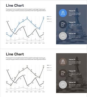
Annual Investment Analysis Graph – Competitor Analysis and Cluster Visualization
#Market and Competitor Analysis #Diagram #Graph
-
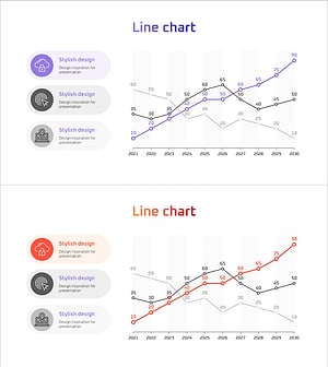
Social Network Market Competitor Analysis PPT – Data Driven Competitive Advantage
#Market and Competitor Analysis #Diagram #Graph
-
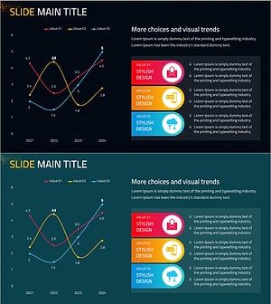
Mobile Service Technology Analysis Graph – Market and Competitor Analysis
#Market and Competitor Analysis #Diagram #Graph
-
Business Competitor Trend Graph – A Tool for Analyzing Competitive Advantage through Market Analysis
#Market and Competitor Analysis #Graph #Competitor Analysis