Blue Green Competitive Analysis Broken Line Graph
RJ0700020_10
- Last Update 07/27/2025
- File Size 1.1MB
- # of Slides 2
- File Format PPTX
- Slide Ratio 16:9
- Color
Keywords
- #Content-Based Slides
- #Design-Based Slides
- #Market and Competitor Analysis
- #Diagram
- #Graph
- #Competitor Analysis
- #Cluster
- #Line
- #Closed Cluster Diagram
- #Line Chart
- #16:9
- #line chart PowerPoint slide
- #trend analysis presentation
- #multi-series graph
- #competitive analysis chart
- #market data visualization
- #PowerPoint graph template
- #10-year trend slide
About the Product
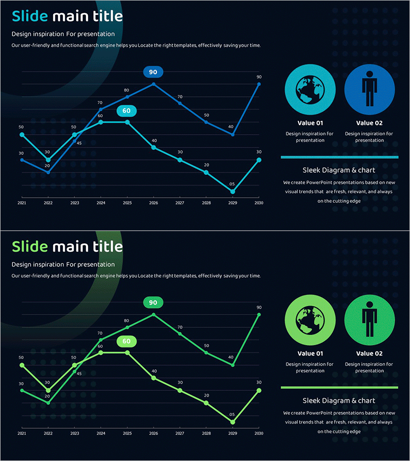
A dual-series line chart PowerPoint slide featuring blue and green color schemes to compare data trends from 2021 to 2030. Each data point displays numerical labels for precise value identification, with two circular value indicator icons (Value 01 and Value 02) positioned on the right side for emphasis. This slide effectively visualizes competitive analysis, market trends, and performance comparisons. The layout combines line graph visualization with supporting text areas, making it ideal for business presentations, quarterly reports, and market analysis decks that require multi-series data representation.
Usage Points
-
Main Usage
Designed to compare two or more data series over time, showing trends and changes across a 10-year period. Ideal for competitive benchmarking, market share evolution, quarterly revenue trends, customer satisfaction metrics, and any scenario requiring multi-series trend visualization.
-
How to Use
Replace the sample data points and numerical values with your actual dataset. The blue and green color scheme can be retained or customized to match your corporate branding. Edit the Value 01 and Value 02 labels and descriptions to reflect your key performance indicators, then adjust the line data to fit your presentation context.
-
Recommended For
Executives, marketing teams, sales departments, and analytics teams presenting quarterly performance reviews, competitive analysis, market research findings, and strategic planning sessions. Particularly effective when comparing two entities (company vs. competitor, year-over-year, regional performance) or tracking dual metrics simultaneously.
-
Slide Structure
2-slide set. Each slide features a dual-series line graph with 10 data points per series, numerical value labels at each point, a title area on the left, and two circular value indicator icons with accompanying text boxes on the right. Optimized for 16:9 widescreen format.
Related Products
-

Competitor Analysis Broken Line Graph – Visualizing Market Trends
#Market and Competitor Analysis #Diagram #Graph
-

Experimental Analysis Graph – Insights through Data Visualization
#Technical Approach #Market and Competitor Analysis #Diagram
-

Competitor Market Analysis Broken Line Graph – Enhance Business Strategy with Data Visualization
#Market and Competitor Analysis #Diagram #Graph
-

Interior Market Analysis Graph – Insights into Market Status
#Market and Competitor Analysis #Diagram #Graph
