Competitor Market Analysis Broken Line Graph – Enhance Business Strategy with Data Visualization
RM0100013_10
- Last Update 01/28/2025
- File Size 0.4MB
- # of Slides 2
- File Format PPTX
- Slide Ratio 16:9
- Color
Keywords
- #Content-Based Slides
- #Design-Based Slides
- #Market and Competitor Analysis
- #Diagram
- #Graph
- #Competitor Analysis
- #Market Analysis
- #Cluster
- #Line
- #Closed Cluster Diagram
- #Line Chart
- #16:9
- #broken line graph PowerPoint
- #market analysis slide template
- #data visualization presentation
- #trend comparison chart
- #competitor analysis PPT slide
About the Product
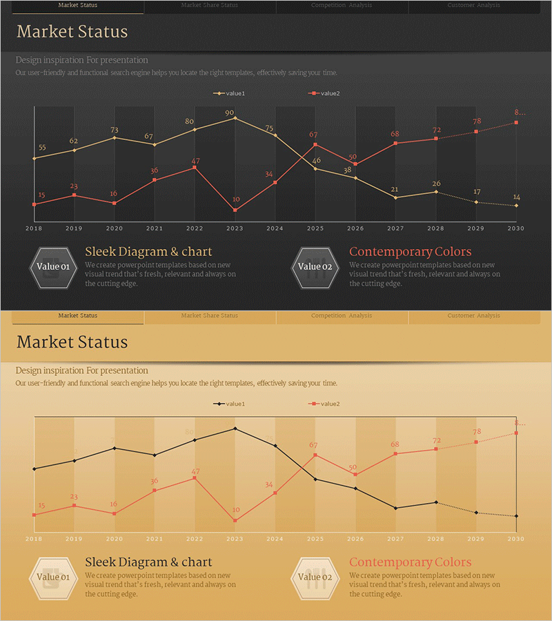
A dual-series broken line graph PowerPoint slide designed to compare data changes over time from 2018 to 2030. This presentation template includes two design variations: dark background and beige background versions. Each data point is labeled with precise numerical values, and the contrasting color scheme (gold and red tones) clearly distinguishes between the two data series. Ideal for competitive analysis, market trend reports, sales performance tracking, and strategic business presentations. The slide structure supports easy customization for various business metrics and analytical purposes.
Usage Points
-
Main Usage
Visualize and compare two or more data series over time to identify market trends, competitive positioning, and performance patterns. Perfect for displaying quarterly sales comparisons, market share evolution, customer satisfaction trends, and other time-series business metrics in a clear, professional manner.
-
How to Use
Replace the sample data points and numerical labels with your actual business data. Choose between the dark background version for formal executive reports or the beige version for warmer, more approachable presentations. Colors, legends, and axis labels can be freely modified to match your brand guidelines.
-
Recommended For
Executive business reports, quarterly performance presentations, market analysis documents, competitive benchmarking materials, investor pitch decks, marketing strategy meetings, and financial reviews. Recommended for finance teams, marketing departments, strategy offices, and sales organizations requiring data-driven decision-making presentations.
-
Slide Structure
Dual-series broken line graph spanning 2018–2030 with approximately 13 data points per series representing monthly or quarterly intervals. Each node displays precise numerical labels. The chart includes a legend distinguishing Value 01 and Value 02. Two color theme variations provided: dark grid background and beige background.
Related Products
-

Competitor Analysis Broken Line Graph – Visualizing Market Trends
#Market and Competitor Analysis #Diagram #Graph
-

Interior Market Analysis Graph – Insights into Market Status
#Market and Competitor Analysis #Diagram #Graph
-

Clustered Vertical Bar Graph Slide – Visualizing Market Analysis
#Market and Competitor Analysis #Diagram #Graph
-

Business Area Analysis Graph – Suitable for Market and Competitive Analysis
#Market and Competitor Analysis #Diagram #Graph
