Market Share Donut Pie Chart – Visualization of Data Analysis
RJ0400009_14
- Last Update 05/19/2025
- File Size 0.3MB
- # of Slides 2
- File Format PPTX
- Slide Ratio 16:9
- Color
Keywords
- #Content-Based Slides
- #Design-Based Slides
- #Company Introduction
- #Market and Competitor Analysis
- #Diagram
- #Graph
- #Key Achievements
- #Market Share
- #Cluster
- #Circles
- #Closed Cluster Diagram
- #Doughnut Chart
- #16:9
- #donut chart PowerPoint
- #pie chart slide template
- #market share visualization
- #business data analysis
- #donut graph presentation
- #how to create donut chart in PowerPoint
About the Product
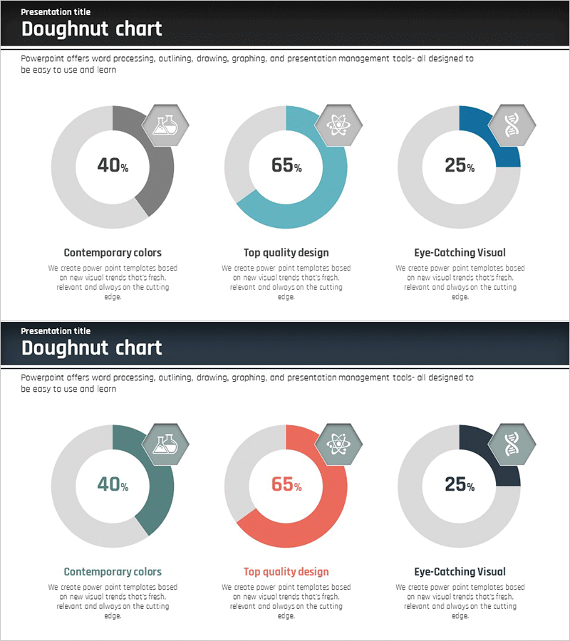
A donut pie chart PowerPoint slide designed to visualize market share and business data with clarity and impact. The center circle emphasizes key metrics, while the outer ring is divided into three segments to display proportional data for each category. A neutral gray base tone is enhanced with teal, red, and navy blue accent colors to distinguish data series, and hexagonal icons beside each segment provide symbolic category representation. This presentation template is ready to use in executive reports, business analysis presentations, and analytical documents where you need to communicate composition ratios, market share, sales distribution, and comparative metrics.
Usage Points
-
Main Usage
Optimized for expressing the relationship between whole and parts—such as market share, sales distribution, and composition ratios. The center circle highlights key metrics, while the three outer segments enable detailed comparison and analysis of component items.
-
How to Use
Apply this template to executive reports, business analysis presentations, marketing strategy pitches, and financial performance briefings to support data-driven decision-making. Replace segment values and labels with your own data, and customize colors and icons to align with your brand identity or presentation theme.
-
Recommended For
Ideal for executives, financial analysts, marketing professionals, business analysts, and consultants who rely on data-driven insights. Suitable for quarterly performance reviews, market research presentations, competitive analysis, customer segmentation strategies, and other business contexts requiring proportional data visualization.
-
Slide Structure
Two-slide layout, each featuring three donut charts. The first slide emphasizes teal accents, the second highlights red accents, allowing representation of different data sets with distinct color schemes. Each donut chart includes a center percentage value, three outer ring segments, and a hexagonal icon. Optimized for 16:9 widescreen format.
Related Products
-

Conservation Donut Chart – Visualization of Sustainability
#Company Introduction #Market and Competitor Analysis #Diagram
-

Blue Line Wide Template Donut Chart – Performance Analysis
#Company Introduction #Market and Competitor Analysis #Graph
-

Visualizing Physical Championship Winning Status with Doughnut Chart
#Company Introduction #Market and Competitor Analysis #Graph
-

Visualization of Traditional Items Proportion – Market Share Analysis
#Company Introduction #Market and Competitor Analysis #Graph
