Graph of Usage Patterns by Year – Visualizing Market Conditions through Cluster Slides
RJ0300091_26
- Last Update 05/14/2025
- File Size 2.6MB
- # of Slides 2
- File Format PPTX
- Slide Ratio 16:9
- Color
Keywords
- #Content-Based Slides
- #Design-Based Slides
- #Market and Competitor Analysis
- #Diagram
- #Graph
- #Market Status
- #Competitor Analysis
- #Cluster
- #Line
- #Closed Cluster Diagram
- #Line Chart
- #16:9
- #line chart PowerPoint
- #annual data analysis slides
- #trend comparison template
- #multi-series graph PPT
- #market analysis chart download
About the Product
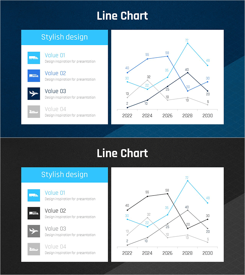
A multi-series line chart PowerPoint slide visualizing data changes from 2022 to 2030 across four distinct data series. The slide features a light blue, black, and gray color palette with clearly labeled data points and numerical values at each intersection. The left panel includes a legend with Value 01 through Value 04 descriptions, while the right panel displays the line chart with five-year intervals on the X-axis. This 16:9 widescreen format slide deck (2 slides) is ready for immediate use in presentations on market analysis, competitive benchmarking, and performance trends.
Usage Points
-
Main Usage
Designed to compare and visualize data changes over time across multiple series simultaneously. Perfect for presenting market conditions, competitive performance benchmarks, business results trends, customer satisfaction evolution, and other time-based numerical changes in a clear, comparative format.
-
How to Use
Replace the legend items on the left with your actual category names and descriptions. Update the graph data points and numerical values on the right with your real data. Modify the year labels on the X-axis to match your time period (annual, quarterly, monthly), and adjust the line colors as needed to match your brand or presentation theme.
-
Recommended For
Ideal for executives, marketing teams, sales departments, and analytics teams presenting business performance reports, market analysis findings, and competitive benchmarking results. Suitable for quarterly performance reviews, annual evaluations, customer data analysis, revenue trend analysis, and data-driven decision-making presentations.
-
Slide Structure
Two-slide deck with each slide featuring a left legend panel (4 input areas for item descriptions) and a right line chart (5-year X-axis, numerical Y-axis, 4 distinct data series). Each data point displays its numerical value for precise communication, with light blue, black, and gray line colors ensuring clear series differentiation.
Related Products
-

Annual Logistics Volume Trend Line Chart
#Market and Competitor Analysis #Graph #Market Status
-

Competitor Analysis Broken Line Graph – Visualizing Market Trends
#Market and Competitor Analysis #Diagram #Graph
-

Competitor Market Analysis Broken Line Graph – Enhance Business Strategy with Data Visualization
#Market and Competitor Analysis #Diagram #Graph
-

Chemical Experiment Analysis Broken Line Graph – Insights and Data Visualization
#Market and Competitor Analysis #Diagram #Graph
