Sewing Graph Chart – Market Status and Performance Analysis
RJ0600059_19
- Last Update 07/06/2025
- File Size 4.3MB
- # of Slides 2
- File Format PPTX
- Slide Ratio 16:9
- Color
Keywords
- #Content-Based Slides
- #Design-Based Slides
- #Business Strategy
- #Market and Competitor Analysis
- #Diagram
- #Graph
- #Achievements
- #Market Status
- #Cluster
- #Line
- #Closed Cluster Diagram
- #Line Chart
- #16:9
- #line chart PowerPoint
- #market analysis presentation
- #4-series data visualization
- #performance tracking slide
- #competitive analysis PPT
- #business chart template
About the Product
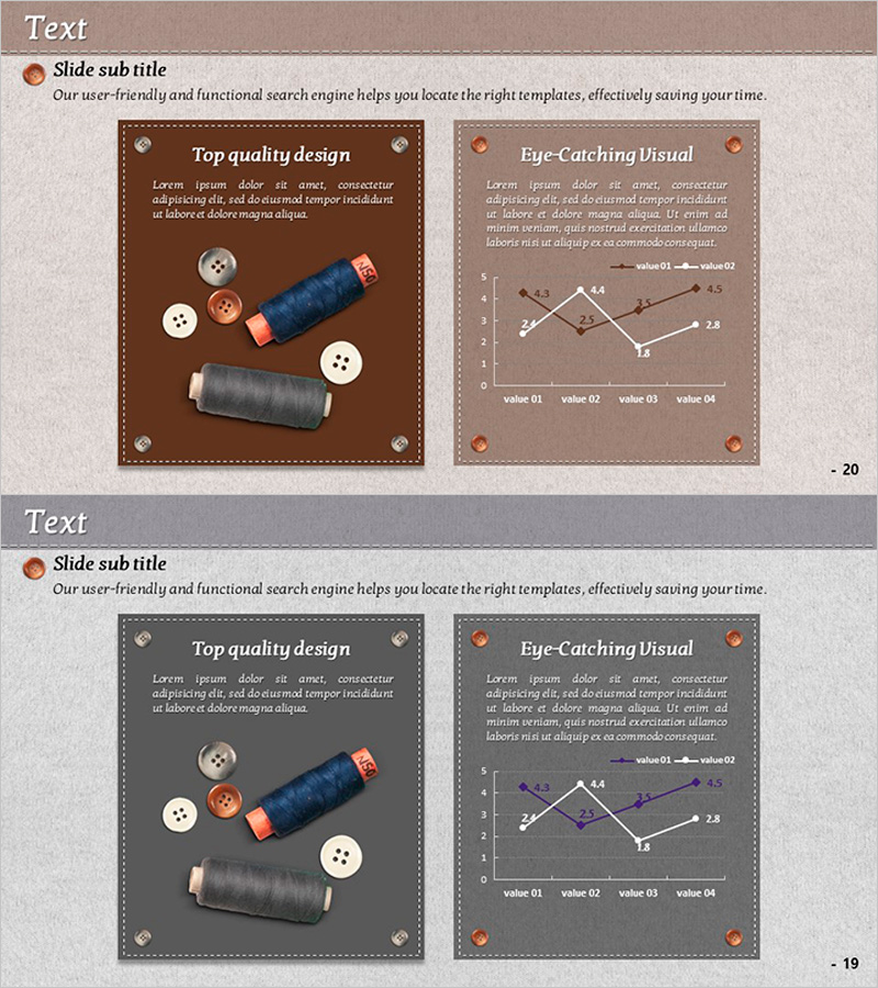
A professional line chart PowerPoint slide designed to compare market status and performance metrics at a glance. This 2-slide set features a left panel with industry-related product imagery (thread spools and buttons) paired with a right-side line graph showing four data series over time. The second slide emphasizes the same chart against a dark background for enhanced visibility. Warm color tones in brown, orange, and gray create a business-appropriate aesthetic, with clearly marked data points ideal for competitive analysis and strategic planning presentations. Fully editable PPTX format enables quick customization for your specific metrics.
Usage Points
-
Main Usage
Visualize time-series data across four metrics—such as market trends, revenue performance, or competitor benchmarks—simultaneously. Ideal for executive reports, investor presentations, and strategic planning sessions where data-driven decision-making requires clear trend comparison.
-
How to Use
Replace the left panel text with your industry context or analysis background. Update the line chart data points and legend with your actual figures. Adjust line colors and thickness to emphasize key metrics. The 16:9 widescreen format ensures optimal display on modern presentation systems.
-
Recommended For
Executives, business analysts, marketing strategists, and financial professionals presenting quarterly or annual performance reviews, market trend analysis, and competitive strategy. Particularly effective for multi-metric comparisons in board meetings and investor pitch decks.
-
Slide Structure
2-slide layout: Slide 1 combines left-aligned product imagery (thread spools, buttons) with text area and right-side line graph (4 series, 4 data points, legend included). Slide 2 emphasizes the same 4-series line chart on dark background. Consistent warm color palette (brown, orange, gray) throughout.
Related Products
-

Curve Graph of a Meal – Business Strategy
#Business Strategy #Market and Competitor Analysis #Graph
-

Market Status Chart Analysis – Data-Driven Insights
#Business Strategy #Market and Competitor Analysis #Graph
-

Graph of Usage Patterns by Year – Visualizing Market Conditions through Cluster Slides
#Market and Competitor Analysis #Diagram #Graph
-

Building Trends Line Chart – Visual Tool for Performance Analysis
#Business Strategy #Market and Competitor Analysis #Graph
