Graph Comparing Transportation Methods – Market Overview Analysis
RJ0300092_23
- Last Update 05/15/2025
- File Size 1.2MB
- # of Slides 2
- File Format PPTX
- Slide Ratio 16:9
- Color
Keywords
- #Content-Based Slides
- #Design-Based Slides
- #Market and Competitor Analysis
- #Graph
- #Other
- #Market Status
- #Competitor Analysis
- #Line
- #Line Chart
- #Mockup
- #16:9
- #line chart PowerPoint slide
- #dual-series trend analysis template
- #data visualization presentation
- #market analysis slide download
- #transportation comparison chart
About the Product
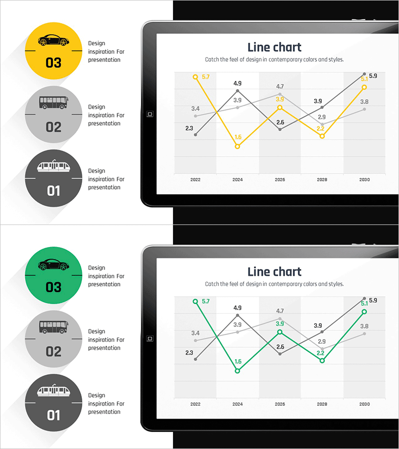
A dual-series line chart PowerPoint slide designed to visualize transportation method usage trends from 2022 to 2030. The slide features yellow and green trend lines with labeled data points, accompanied by three circular transportation icons (car, bus, train) on the left side for category identification. Each data point displays its numerical value for precise information delivery. This presentation template is ideal for market analysis reports, competitive benchmarking, business trend presentations, and quarterly performance reviews requiring clear visual comparison of two data series over time.
Usage Points
-
Main Usage
Effectively compare and analyze two data series over time, making it ideal for tracking market trends, competitive performance, usage rate changes, and business metrics. The dual-line format enables stakeholders to identify patterns, correlations, and divergences between two related datasets at a glance.
-
How to Use
Replace the transportation icons on the left with your comparison categories. Update the data values in the line chart to reflect your actual metrics. Both the yellow and green line colors are fully editable, and you can adjust the year range, data points, and axis labels to match your specific analysis period.
-
Recommended For
Marketing professionals presenting market analysis, executives reviewing quarterly performance, sales teams conducting competitive analysis, business consultants analyzing industry trends, researchers presenting longitudinal data, and students preparing thesis presentations or project reports.
-
Slide Structure
Two-slide set in 16:9 widescreen format. Slide 1 features a yellow-toned dual-series line chart; Slide 2 presents the same data structure in green tones. Each slide includes three circular category icons (left side) and a line graph with 8 data points spanning 2022-2030, with gridlines for easy value reading.
Related Products
-

Market Analysis Graph & Notebook Mockup – Understanding the Market through Data Visualization
#Market and Competitor Analysis #Graph #Other
-

Annual Logistics Volume Trend Line Chart
#Market and Competitor Analysis #Graph #Market Status
-

Graph of Usage Patterns by Year – Visualizing Market Conditions through Cluster Slides
#Market and Competitor Analysis #Diagram #Graph
-

Competitor Analysis PC Mockup Graph – Market Trends and Insights
#Market and Competitor Analysis #Graph #Other
