Social Network Market Competitor Analysis PPT – Data Driven Competitive Advantage
RJ0400068_14
- Last Update 06/05/2025
- File Size 0.2MB
- # of Slides 2
- File Format PPTX
- Slide Ratio 16:9
- Color
Keywords
- #Content-Based Slides
- #Design-Based Slides
- #Market and Competitor Analysis
- #Diagram
- #Graph
- #Competitor Analysis
- #Competitive Advantage
- #Cluster
- #Line
- #Closed Cluster Diagram
- #Line Chart
- #16:9
- #line chart PowerPoint slide
- #multi-series trend analysis
- #data visualization template
- #market analysis chart
- #competitor comparison graph
About the Product
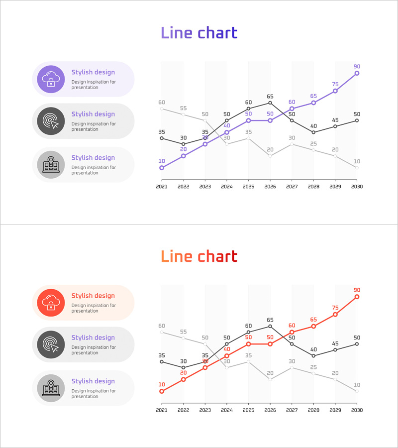
A multi-series line chart PowerPoint slide comparing data trends from 2021 to 2030 across three distinct data series. Purple, orange, and gray trend lines clearly visualize numerical changes over time. An icon-based legend on the left side intuitively communicates the meaning of each series. This presentation slide is ready to use for data-driven discussions such as market analysis, competitor benchmarking, and performance tracking in business reports and proposals.
Usage Points
-
Main Usage
Compares and analyzes trends of multiple data series simultaneously over time. Enables quick visualization of market share evolution, competitor performance comparison, revenue trends, customer satisfaction changes, and other multi-variable data flows in a single view.
-
How to Use
Place this slide in the market analysis or competitive analysis section of reports, proposals, or executive briefings. Reassign series colors by organization, product, or region, then input your data for immediate use. Click legend icons to edit series names and customize the chart.
-
Recommended For
Marketing professionals, strategy planners, sales executives, financial analysts, and consultants presenting competitive analysis, market trends, and performance metrics. Particularly effective for business presentations requiring multi-variable comparison and data-driven storytelling.
-
Slide Structure
Two-slide layout. The first slide emphasizes the purple primary series; the second emphasizes the orange primary series, presenting the same data from different analytical perspectives. Each slide contains 10 time points (2021–2030), three data series, and three icon-based legend items on the left.
Related Products
-

Service Analysis Line Graph – Visualization of Competitive Advantage
#Market and Competitor Analysis #Diagram #Graph
-

Mobile Service Technology Analysis Graph – Market and Competitor Analysis
#Market and Competitor Analysis #Diagram #Graph
-

Annual Investment Analysis Graph – Competitor Analysis and Cluster Visualization
#Market and Competitor Analysis #Diagram #Graph
-

Competitive Advantage Analysis Graph – Market and Competitor Analysis
#Market and Competitor Analysis #Graph #Competitor Analysis
