Bar Graph of Progress Analysis by Task - Effective Visualization of Progress
RJ0300064_19
- Last Update 05/06/2025
- File Size 0.1MB
- # of Slides 2
- File Format PPTX
- Slide Ratio 16:9
- Color
Keywords
- #Content-Based Slides
- #Design-Based Slides
- #Product/Service Introduction
- #Market and Competitor Analysis
- #Marketing Plan and Strategy
- #Diagram
- #Graph
- #Development Status
- #Market Analysis
- #Cluster
- #Column
- #Closed Cluster Diagram
- #Segmented Column
- #16:9
- #horizontal bar chart PowerPoint
- #progress analysis slide
- #stacked bar graph template
- #data visualization PPT
- #year-over-year comparison chart
About the Product
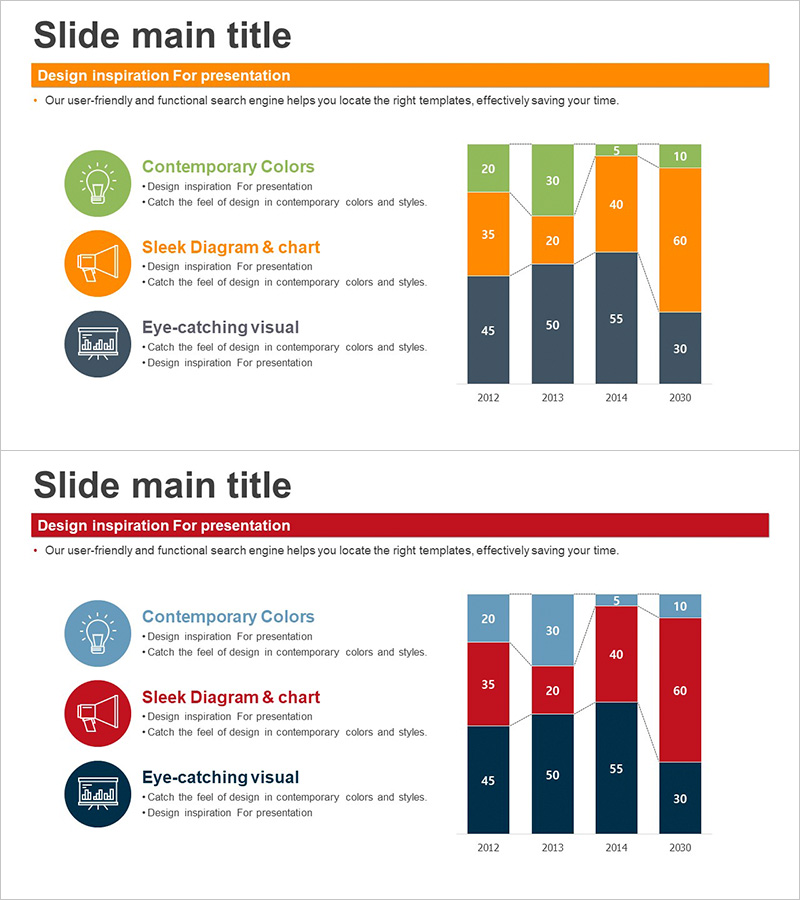
A horizontal bar chart PowerPoint slide that visualizes year-over-year progress analysis across multiple categories from 2012 to 2030. The slide features a two-column layout with three circular icon elements and descriptive text on the left (Contemporary Colors, Sleek Diagram & chart, Eye-catching visual), and a stacked horizontal bar chart on the right. The chart displays 4 years of data segmented into 5 categories, using a 4-color palette of orange, green, gray, and black to distinguish each data series. The design enables clear data comparison and trend analysis for presentations, reports, and executive briefings.
Usage Points
-
Main Usage
Visualize year-over-year, department-by-department, or project-by-project progress using stacked horizontal bars to effectively communicate data comparison and trend analysis. The multi-category format allows viewers to compare multiple data series simultaneously, making it ideal for performance reports, analytical presentations, and executive briefings.
-
How to Use
Edit the left-side icon labels and descriptive text to match your presentation topic and key messages. Adjust the bar values, heights, and color segments on the right to reflect your actual data. Modify the year labels and category values to customize the chart for your specific analysis needs.
-
Recommended For
Executives, marketing teams, project managers, finance professionals, and data analysts presenting quarterly or annual performance analysis, budget execution status, sales performance comparison, and project progress reports. Particularly effective for comparing performance across multiple departments, regions, or product lines in management presentations.
-
Slide Structure
2-slide set with two-column layout. Left column contains 3 circular icon elements with accompanying text descriptions. Right column features a stacked horizontal bar chart with 4 year labels (2012, 2013, 2014, 2030) and 5 data categories per year, rendered in 4-color series (orange, green, gray, black) for clear visual distinction.
Related Products
-

Stacked Vertical Bar Chart Layout – Product Performance Analysis
#Product/Service Introduction #Marketing Plan and Strategy #Diagram
-

Market Analysis Pie Chart – Vibrant Visualization in Contemporary Colors
#Product/Service Introduction #Market and Competitor Analysis #Diagram
-

Space Industry Positioning Diagram – Market Analysis and Strategy
#Market and Competitor Analysis #Marketing Plan and Strategy #Diagram
-

Space Industry Analysis Smooth Line Graph
#Market and Competitor Analysis #Marketing Plan and Strategy #Diagram
