Vertical Bar Graph for Sector Analysis – Optimizing Data Visualization
RJ0300029_29
- Last Update 04/26/2025
- File Size 1.5MB
- # of Slides 2
- File Format PPTX
- Slide Ratio 16:9
- Color
Keywords
About the Product
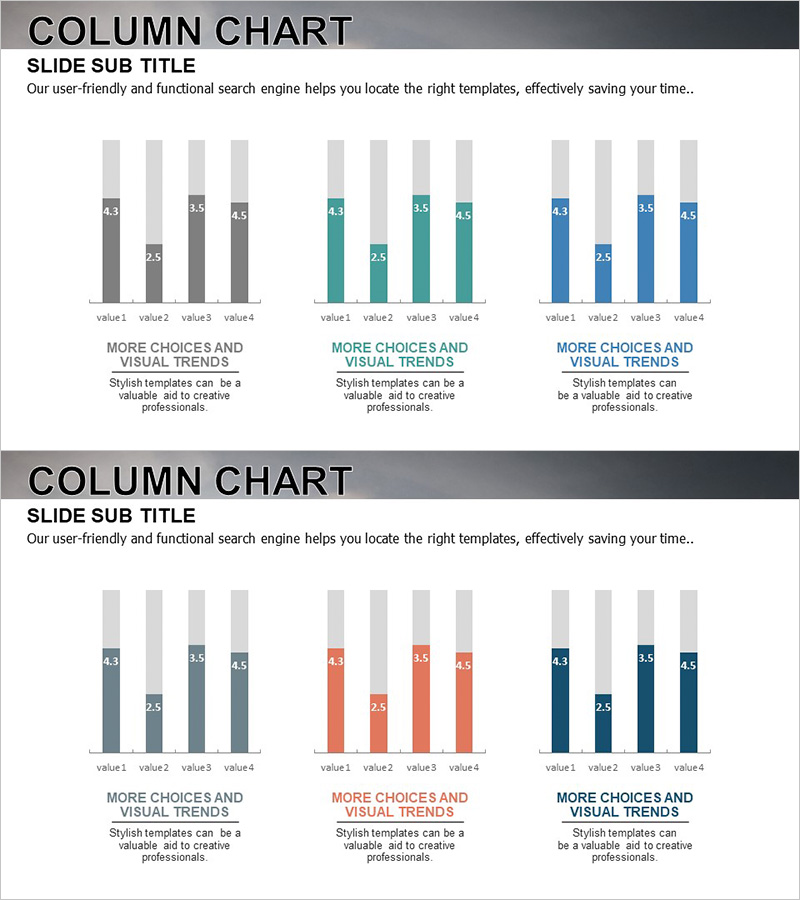
A vertical bar chart PowerPoint slide designed for market analysis and competitive benchmarking. This presentation template features three color-coded data series—gray, teal, and blue—displaying four data points with labeled values for precise numerical communication. The slide effectively visualizes sector performance, quarterly results, and competitive positioning in business reports, marketing plans, and investor presentations. The 16:9 widescreen format includes 2 slides that are fully editable in PowerPoint, allowing you to input your own data and customize colors to match your brand guidelines.
Usage Points
-
Main Usage
This slide visualizes four data points using vertical bars in three distinct color series—gray, teal, and blue—enabling clear comparison of numerical data across categories. Each bar is labeled with its value, ensuring precise data communication. Ideal for comparing market sizes, quarterly performance, competitive metrics, and sector-specific analysis.
-
How to Use
Insert this slide into business reports, marketing plans, and investor presentations within the performance analysis or market overview section. Edit the bar heights and values directly in PowerPoint to reflect your actual data. Adjust the legend, axis labels, and color scheme to align with your presentation theme. Use during presentations to highlight numerical differences and support data-driven conclusions.
-
Recommended For
Finance professionals, marketing teams, business analysts, management consultants, and executives preparing performance reports and strategic presentations. Particularly suitable for quarterly earnings reviews, regional or departmental performance comparisons, market research presentations, and competitive analysis briefings.
-
Slide Structure
Two slides in 16:9 widescreen format, each displaying a vertical bar chart with four data categories (value1–value4) represented in three color-coded series. The first slide uses gray tones; the second uses teal and blue tones. Numerical values are labeled above each bar segment for clarity. The layout is clean and professional, suitable for corporate and academic presentations.
Related Products
-

Visualizing Bar Graphs with PC Mockups – Competitive Market Analysis Tool
#Market and Competitor Analysis #Graph #Other
-

Fintech Market Analysis Bar Graph – Clear Data Visualization
#Market and Competitor Analysis #Diagram #Graph
-

Vertical Bar Market Analysis Segmentation Graph - Data Visualization
#Market and Competitor Analysis #Graph #Competitor Analysis
-

Subdivided Bar Graph for Visual Market Analysis – Presenting Competitive Data Effectively
#Market and Competitor Analysis #Diagram #Graph
