User Analysis Results Diagram - Infographic for Customer Insights
RJ0300029_26
- Last Update 04/26/2025
- File Size 1.6MB
- # of Slides 2
- File Format PPTX
- Slide Ratio 16:9
- Color
Keywords
About the Product
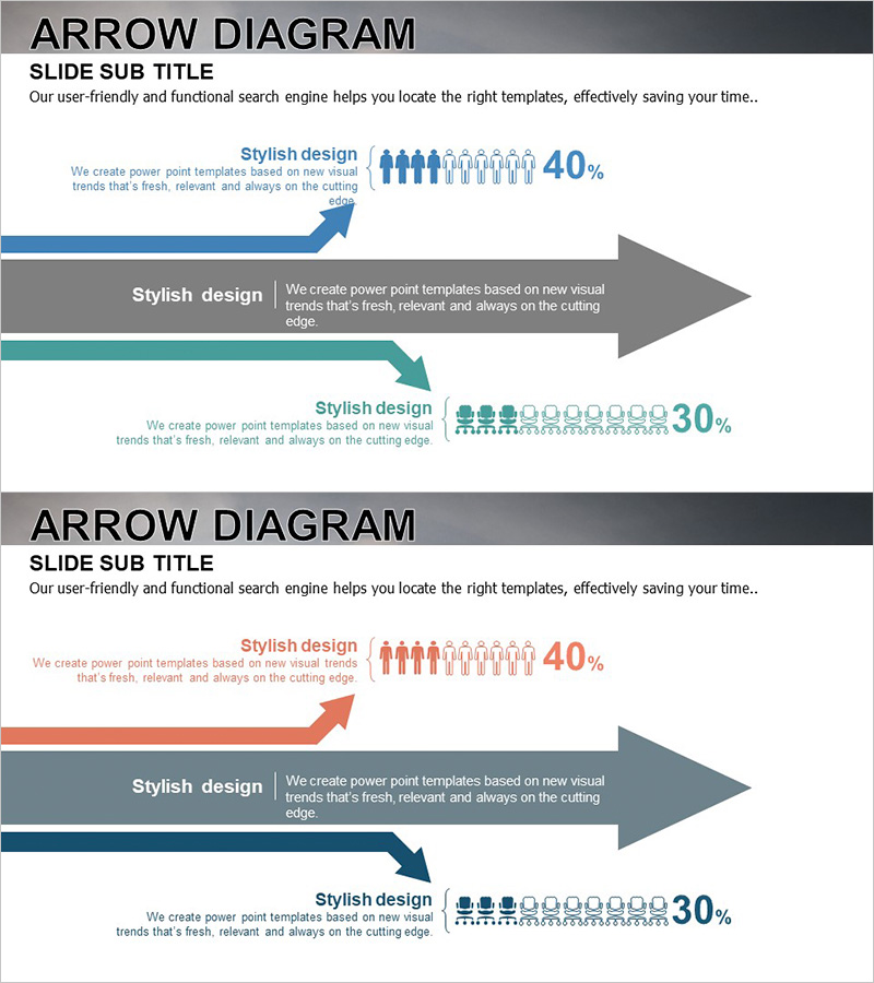
A multi-color arrow flow diagram PowerPoint slide designed to visualize user analysis results and customer segmentation. This 2-slide set features blue, orange, and teal color schemes with directional arrows, people icons, and percentage data integrated into each stage. The infographic layout enables clear communication of customer demographics, behavioral insights, and market analysis findings. Ideal for marketing presentations, business proposals, and customer strategy discussions. Delivered in 16:9 widescreen PPTX format with fully editable elements.
Usage Points
-
Main Usage
Communicate user segmentation and customer analysis results through directional arrow flows, making complex demographic and behavioral data accessible to stakeholders. The multi-stage layout supports comparative analysis and highlights key customer insights for strategic decision-making.
-
How to Use
Insert into marketing strategy presentations, business proposals, and customer analysis reports to illustrate target audience composition and market segmentation. Use in investor pitch decks to demonstrate customer understanding, or in quarterly business reviews to show customer demographic trends and shifts.
-
Recommended For
Marketing managers, business strategists, sales directors, and executives presenting customer analysis findings. Suitable for startup pitch decks, corporate marketing strategy meetings, consulting reports, and customer research presentations where visual clarity of user segmentation is critical.
-
Slide Structure
2-slide template with 3 directional arrow flows per slide (upward, center, downward). Each arrow accommodates text labels, people icons (5–10 figures per stage), and percentage values. Color-coded by category (blue, orange, teal) for easy data differentiation and visual hierarchy.
Related Products
-

User Gender Ratio Analysis Graph – Essential Tool for Market and Customer Analysis
#Market and Competitor Analysis #Graph #Other
-

User Analysis Pictogram Graph – Visualizing Customer Success
#Market and Competitor Analysis #Customer Success Stories #Graph
-

Global User Status Analysis Graph – Data Visualization
#Market and Competitor Analysis #Graph #Other
-

Graphic Designer Demand Analysis Slide – Market Insights and Customer Statistics
#Market and Competitor Analysis #Graph #Other
