Orange Green Customer Analysis and Bell Chart
RJ0500006_4
- Last Update 06/08/2025
- File Size 0.6MB
- # of Slides 2
- File Format PPTX
- Slide Ratio 16:9
- Color
Keywords
- #Content-Based Slides
- #Design-Based Slides
- #Market and Competitor Analysis
- #Graph
- #Other
- #Customer Analysis
- #Market Analysis
- #Line
- #Line Chart
- #16:9
- #bell curve chart PowerPoint
- #distribution analysis slide template
- #customer analysis PPT
- #market analysis chart
- #how to create bell curve in PowerPoint
- #data visualization presentation slide
About the Product
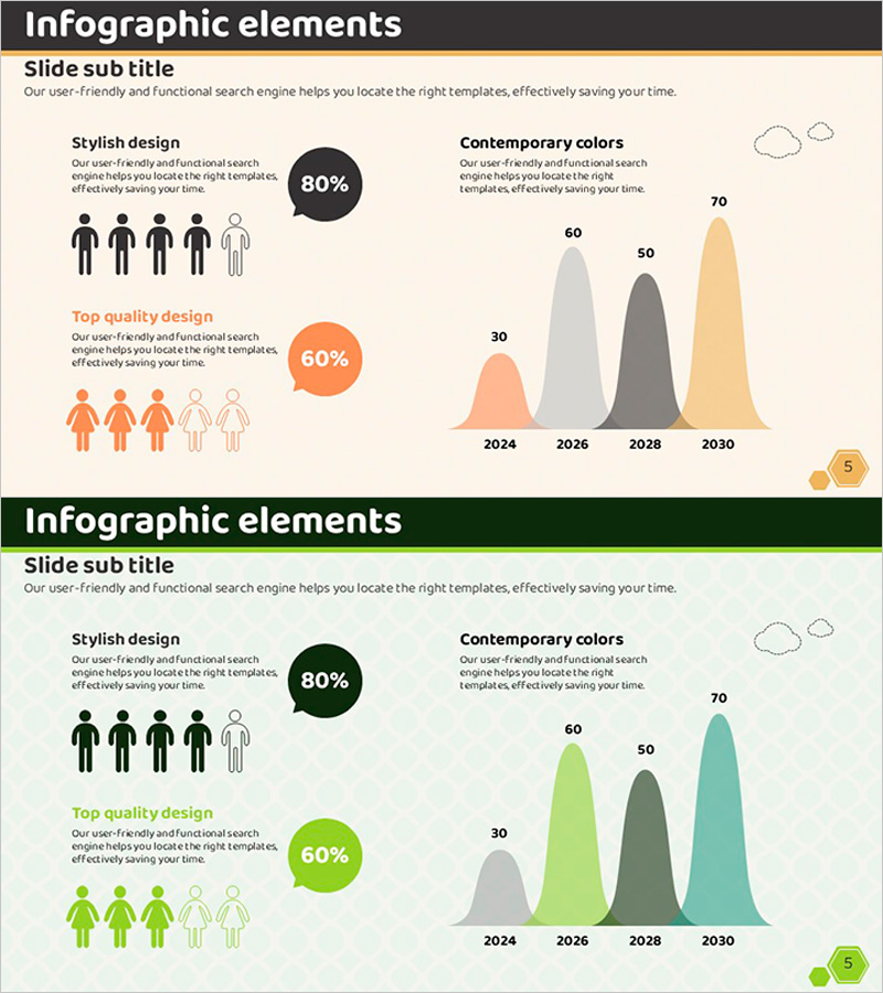
A PowerPoint slide deck featuring bell curve charts for customer and market distribution analysis. This 2-slide template uses four color series—orange, green, gray, and black—to visualize data distribution and trends across time periods from 2024 to 2030. Infographic elements and silhouette icons highlight customer segment characteristics and comparative insights. Ideal for presentations, reports, and strategic proposals where statistical data and predictive analysis need clear visual communication.
Usage Points
-
Main Usage
Visualize customer analysis, market distribution, and statistical data using bell curve charts to support data-driven decision-making. Compare multiple data series over time and identify trends, patterns, and predictive insights for strategic planning.
-
How to Use
Insert into market analysis sections of reports, customer segmentation pages in business plans, and data visualization slides in investor presentations. Modify chart data directly to reflect actual statistics, and customize colors and legends to match your organization's branding guidelines.
-
Recommended For
Marketing professionals, data analysts, business executives, market research specialists, and strategy planning teams who need to communicate customer insights and market trends with visual impact and credibility.
-
Slide Structure
Slide 1 includes infographic elements with 5 silhouette icons, 2 pie charts, and text areas. Slide 2 features a 4-series bell curve chart with time axis (2024–2030), value axis (30–70), legend, and subtitle area for data context.
Related Products
-

Customer and Market Analysis Slide – Yellow and Bluegreen Emotion
#Market and Competitor Analysis #Graph #Other
-

User Analysis Results Diagram - Infographic for Customer Insights
#Market and Competitor Analysis #Graph #Other
-

User Analysis Graph by Year – Insights into Customer Behavior
#Market and Competitor Analysis #Graph #Other
-

Work Performance Analysis Graph – Visually Representing Employee Performance
#Market and Competitor Analysis #Graph #Other
