User Usage Analysis Status Graph
RJ0400065_29
- Last Update 06/05/2025
- File Size 0.2MB
- # of Slides 2
- File Format PPTX
- Slide Ratio 16:9
- Color
Keywords
About the Product
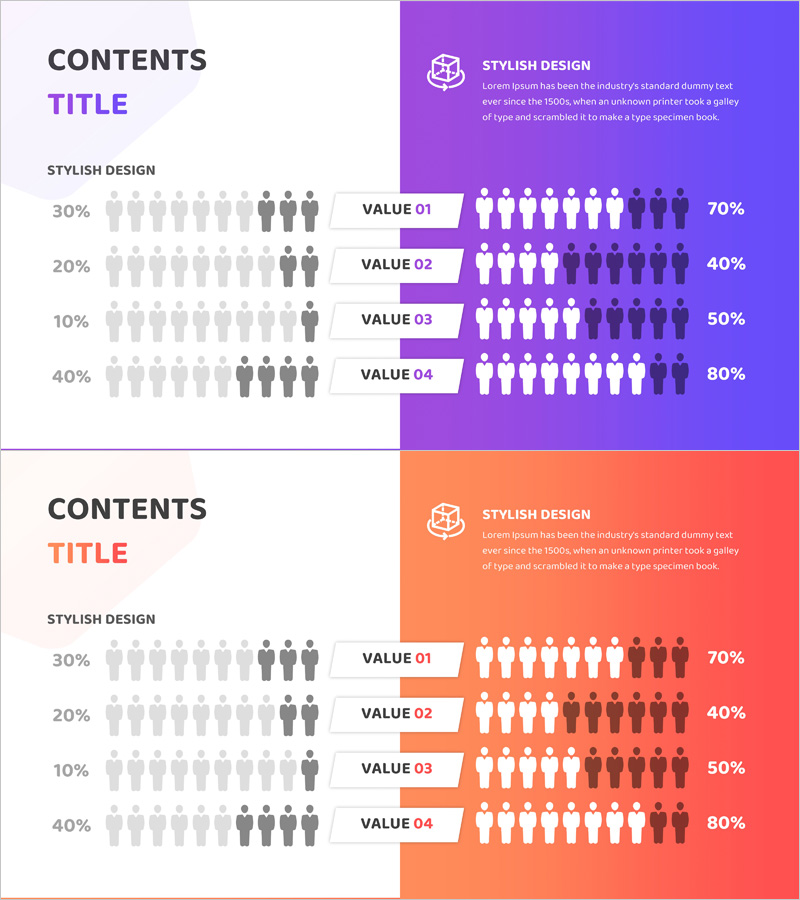
A PowerPoint slide that compares user usage status across four stages with visual data representation. The left side displays percentage metrics while the right side uses human icons to illustrate user distribution at each stage. Available in two color versions—purple and coral—allowing you to match your corporate brand identity. This presentation slide supports data-driven decision-making in market analysis, customer segmentation, and competitive analysis presentations.
Usage Points
-
Main Usage
Visualize and compare user usage patterns across multiple stages to support data-driven business decisions. Ideal for market analysis, customer segmentation, and competitive benchmarking presentations requiring quantitative evidence and clear visual communication.
-
How to Use
Edit the percentage values on the left and adjust the human icon ratios on the right to match your actual data. Select either the purple or coral version based on your corporate brand colors, then replace each VALUE label with specific analysis categories relevant to your presentation.
-
Recommended For
Marketing managers, business strategists, data analysts, and executives presenting quarterly reports. Recommended for new market entry strategies, customer segmentation analysis, competitive positioning presentations, and any situation requiring quantitative data visualization and comparative insights.
-
Slide Structure
Two-slide set featuring one purple version and one coral version. Each slide uses a two-column layout: left side contains title, description text, and four percentage data fields; right side displays colored background with four rows of human icon visualizations. Formatted in 16:9 widescreen ratio for modern presentation environments.
Related Products
-

Work Performance Analysis Graph – Visually Representing Employee Performance
#Market and Competitor Analysis #Graph #Other
-

User Analysis Donut Chart – Optimal for Market and Competitor Analysis
#Market and Competitor Analysis #Graph #Other
-

A Chart for the Total Population – Effective Market Analysis
#Market and Competitor Analysis #Diagram #Graph
-

Silhouette Step Diagram – Effective Tool for Market Analysis
#Market and Competitor Analysis #Graph #Other
