Data Analysis Status Pie Chart – A Tool for Clear Understanding
RJ0300029_11
- Last Update 04/25/2025
- File Size 1.9MB
- # of Slides 2
- File Format PPTX
- Slide Ratio 16:9
- Color
Keywords
About the Product
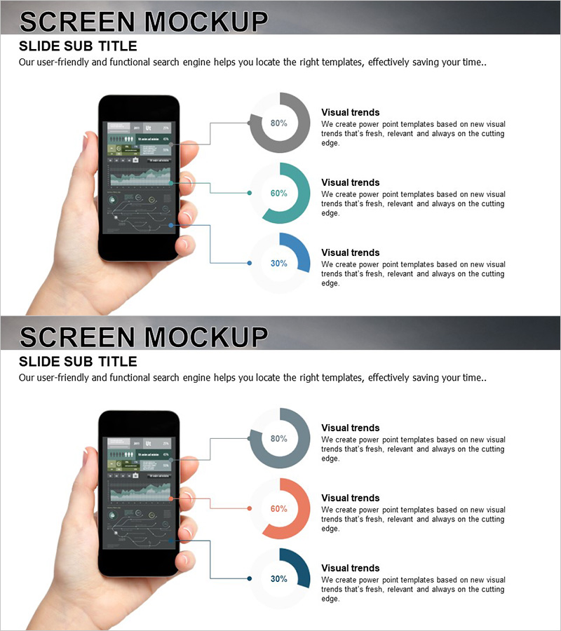
A PowerPoint slide featuring a smartphone device mockup with three pie charts positioned on the right side. Perfect for presenting app features, user statistics, and data analysis results. The three circular charts use gray, teal, and navy blue colors to clearly represent percentage data at 80%, 60%, and 30% respectively. Connection lines and text labels guide viewers through each metric intuitively. Optimized for 16:9 widescreen format with 2-slide layout, this PowerPoint template is ready to use for mobile app presentations, service introductions, and marketing pitch decks.
Usage Points
-
Main Usage
Showcase mobile app features, user statistics, and service performance data alongside a smartphone screen mockup to enhance audience comprehension. Ideal for app developers, marketing teams, and startups pitching user adoption rates, satisfaction scores, and growth metrics in a visually compelling format.
-
How to Use
Position the smartphone device mockup on the left side of the slide with three pie charts vertically aligned on the right. Add item names and descriptions in the text areas next to each chart to provide data context. All colors, percentages, and labels are fully editable to match your specific metrics.
-
Recommended For
Mobile app development companies, IT startups, marketing teams, UX research departments, investor pitch presentations, product launch events, user analysis reports, and app marketing presentations. Especially effective for displaying app download trends, user satisfaction ratings, and feature usage distribution.
-
Slide Structure
2-slide layout. Each slide combines a left-side smartphone mockup (black frame with app UI displayed on screen) and right-side three pie charts (gray 80%, teal 60%, navy 30% proportions). Text boxes beside each chart provide editable areas for metric labels and descriptions, allowing flexible data customization.
Related Products
-

Data Status Analysis Pie Chart – Intuitive Visualization
#Product/Service Introduction #Graph #Other
-

Shopping Status Analysis Graph – Effective Data Presentation
#Product/Service Introduction #Graph #Composition
-

Analysis of Smart Network Systems – Data Visualization for Innovation
#Product/Service Introduction #Diagram #Graph
-

Equipment Demand Survey with Donut Chart – Data Visualization
#Product/Service Introduction #Graph #Other
