Equipment Demand Survey with Donut Chart – Data Visualization
RJ0900011_26
- Last Update 08/19/2025
- File Size 0.9MB
- # of Slides 2
- File Format PPTX
- Slide Ratio 16:9
- Color
Keywords
About the Product
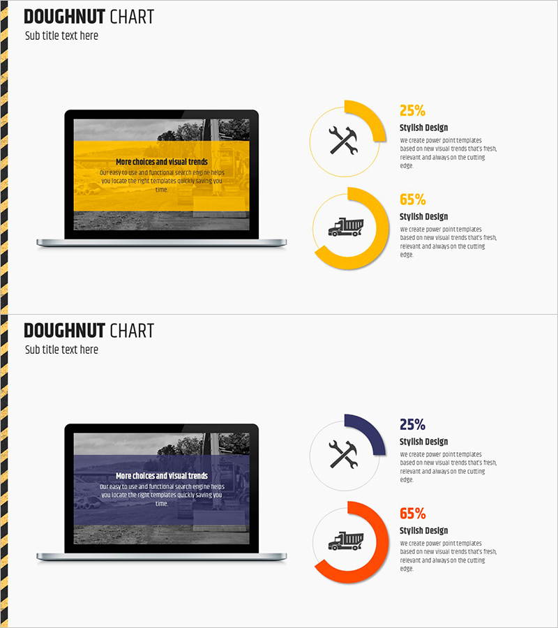
A donut chart PowerPoint slide designed for equipment demand surveys and marketing analysis presentations. This 2-slide set features vibrant color combinations in yellow, navy, and orange to intuitively represent data proportions. Each slide includes a laptop mockup image positioned on the left, allowing you to simulate real presentation environments. Icons and text areas are integrated for immediate use in product introductions, development status updates, market analysis, and other business presentations. Formatted in 16:9 widescreen PPTX, fully compatible with modern PowerPoint versions.
Usage Points
-
Main Usage
Visualize equipment and product demand survey results using donut charts to communicate decision-making data clearly. Proportion-based information representation enhances audience comprehension, while the laptop mockup allows you to preview the actual presentation environment.
-
How to Use
Input actual survey data (percentages or numbers) into the donut chart areas on each slide. Add category names and descriptions to the icon and text box sections. Use color differentiation to emphasize category-specific proportions. The laptop mockup image serves as a background to represent the presentation environment.
-
Recommended For
Product development team market demand analysis presentations, sales team customer preference survey results, executive reports requiring data visualization, marketing planning documents with target analysis, and investor pitch decks explaining market conditions.
-
Slide Structure
2-slide layout. Each slide features a laptop mockup (left side) paired with two donut charts (right side). Slide 1 displays yellow donut segments (25% and 65%), Slide 2 shows navy and orange donut segments (25% and 65%). Each chart includes accompanying icons and text description areas.
Related Products
-

Online Business Marketing Strategy – Data-Driven Decision Making
#Product/Service Introduction #Marketing Plan and Strategy #Graph
-

Five Color PowerPoint Template Wide – Donut Chart
#Product/Service Introduction #Business Vision and Strategy #Graph
-

Plastic Surgery Data Analysis Donut Pie Chart Slide
#Product/Service Introduction #Graph #Other
-

Data Status Analysis Pie Chart – Intuitive Visualization
#Product/Service Introduction #Graph #Other
