Shopping Status Analysis Graph – Effective Data Presentation
RJ0400057_5
- Last Update 06/02/2025
- File Size 0.1MB
- # of Slides 2
- File Format PPTX
- Slide Ratio 16:9
- Color
Keywords
About the Product
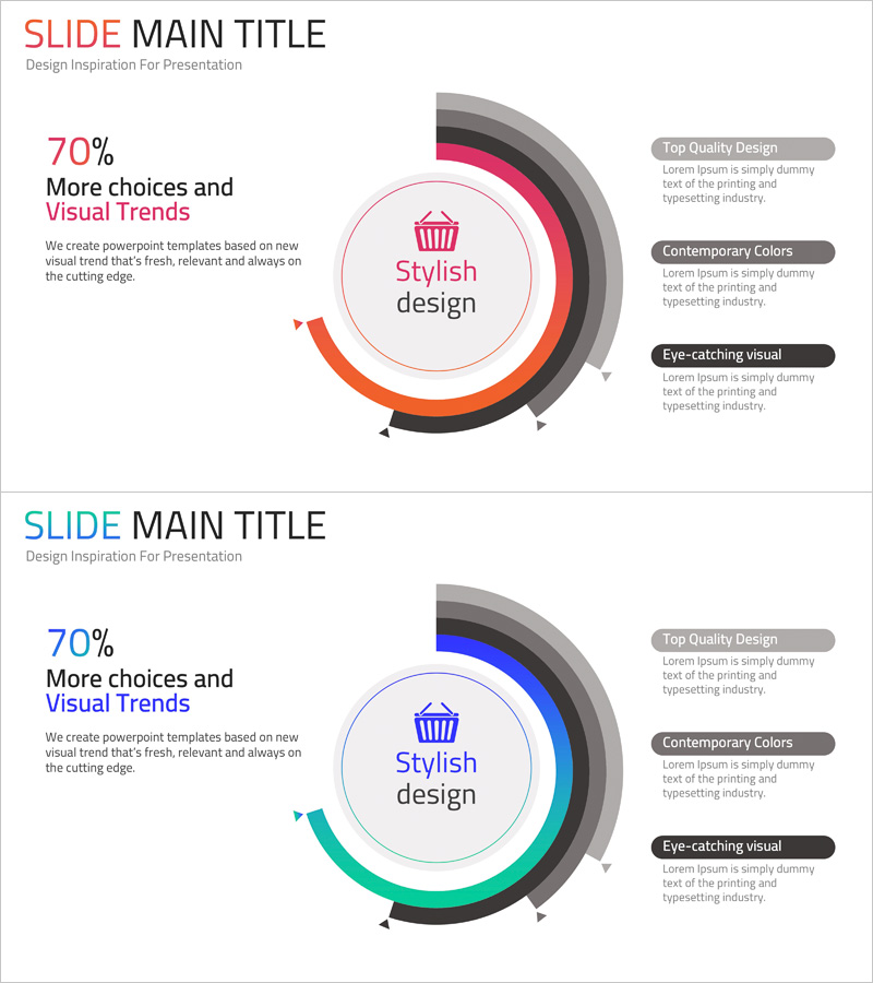
A donut chart PowerPoint slide designed to visualize shopping performance and multi-layer data analysis. The concentric ring structure places a key metric in the center and displays comparative data in surrounding layers, making it ideal for presenting sales figures, customer satisfaction scores, and category breakdowns simultaneously. The gradient rings in pink, orange, and black tones create visual hierarchy, while the right-side text boxes accommodate key insights and findings. Two slide variations with color options (pink, blue, green) allow you to match your brand identity and presentation theme. Formatted in 16:9 widescreen for modern projectors and online presentations.
Usage Points
-
Main Usage
Compare and analyze multiple data dimensions simultaneously—such as sales, customer segments, and product categories. Place core metrics (total revenue, customer count, target achievement rate) in the center circle, and represent detailed item-level proportions in the surrounding ring layers to clarify the importance of each component within the overall context.
-
How to Use
Double-click numbers and text fields to edit directly. Adjust the color and width of each ring section to reflect your data proportions. Add analysis results, insights, and action items in the right-side text boxes to connect visuals with narrative. Choose between two color versions to match your presentation's tone and brand guidelines.
-
Recommended For
Ideal for marketing, sales, and executive reports presenting sales performance, customer segmentation, and product category distribution. Effective for quarterly or annual performance reviews, post-launch market response analysis, customer satisfaction survey results, and any scenario requiring multi-layer comparative data visualization.
-
Slide Structure
2-slide set. Each slide features a central circle for core metrics and 4 concentric rings for data proportion visualization, with 3 text boxes (title, description, insights) positioned on the right. Slide 1 uses pink, orange, and black tones; Slide 2 offers blue, green, and black variations for flexible color matching.
Related Products
-

Data Status Analysis Pie Chart – Intuitive Visualization
#Product/Service Introduction #Graph #Other
-

Analysis of Smart Network Systems – Data Visualization for Innovation
#Product/Service Introduction #Diagram #Graph
-

Composition Donut Circle Graph – Product and Service Introduction
#Product/Service Introduction #Graph #Composition
-

Data Analysis Status Pie Chart – A Tool for Clear Understanding
#Product/Service Introduction #Graph #Other
