Visualized Data with Pie Charts – Intuitive Information Delivery
RJ0300027_23
- Last Update 04/25/2025
- File Size 4.4MB
- # of Slides 2
- File Format PPTX
- Slide Ratio 16:9
- Color
Keywords
About the Product
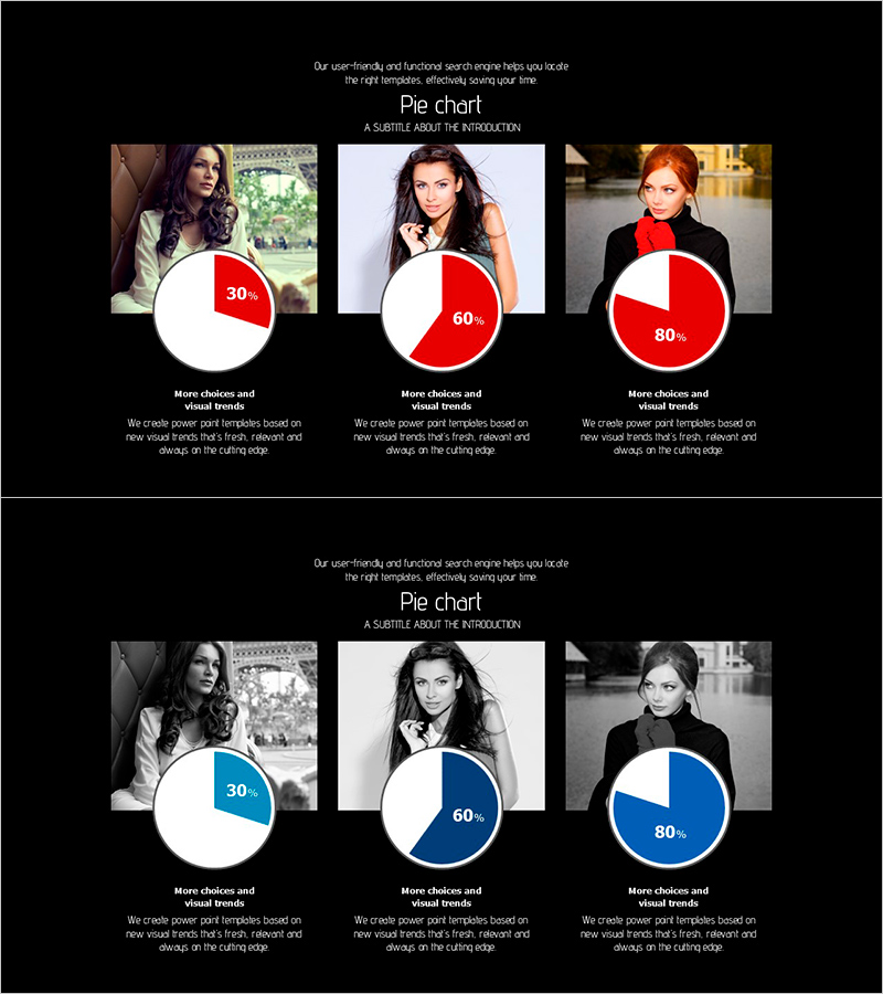
A professional pie chart PowerPoint slide designed to communicate ratio data intuitively across three segments. The dual-tone color scheme—red and blue—enables flexible representation of various proportions (30%, 60%, 80%) while maintaining visual consistency. Each chart is paired with a portrait image and descriptive text below, enhancing information clarity and audience engagement. The 2-slide set provides both red and blue color variations, allowing you to align with your presentation theme and brand identity. Ideal for business proposals, marketing reports, market analysis, and performance dashboards where customer preferences, market share, budget allocation, or KPI distribution need clear visual communication.
Usage Points
-
Main Usage
Transform quantitative data—customer preferences, market share, budget distribution, performance metrics—into clear visual segments. The labeled pie chart format enables audiences to instantly grasp proportional relationships without requiring detailed explanation, making complex data accessible and persuasive.
-
How to Use
Insert into the data or analysis section of business proposals, marketing reports, or strategic presentations. Replace the portrait images with customer personas or target demographic photos to create contextual storytelling. Leverage the dual-tone color variations to match your presentation tone and corporate branding guidelines.
-
Recommended For
Marketing managers, business analysts, sales executives, consultants, financial planners, and product strategists who need to present data-driven insights. Particularly effective for consumer research findings, market penetration analysis, budget justification, and quarterly performance reviews.
-
Slide Structure
2-slide set with 3 pie charts per slide (representing 30%, 60%, 80% proportions). Each slide features a left-aligned portrait image, three pie charts in the center, and descriptive text below. Slide 1 uses red-tone palette; Slide 2 uses blue-tone palette for flexible color selection.
Related Products
-

Market Analysis Pie Chart – Vibrant Visualization in Contemporary Colors
#Product/Service Introduction #Market and Competitor Analysis #Diagram
-

Curved Theme Purple Pie Chart for Business Strategy and Vision Presentation
#Company Introduction #Business Vision and Strategy #Diagram
-

Medical Business Profit Structure Analysis Pie Chart
#Product/Service Introduction #Business Introduction #Diagram
-

Watch Shape Market Share Graph – Data Visualization and Analysis
#Product/Service Introduction #Market and Competitor Analysis #Diagram
