Market Share Comparison 3D Pie Chart – Market Insight
RJ0500018_8
- Last Update 06/12/2025
- File Size 0.5MB
- # of Slides 2
- File Format PPTX
- Slide Ratio 16:9
- Color
Keywords
- #Content-Based Slides
- #Design-Based Slides
- #Market and Competitor Analysis
- #Diagram
- #Graph
- #Competitor Analysis
- #Market Share
- #Cluster
- #Circles
- #Closed Cluster Diagram
- #Pie Chart
- #16:9
- #pie chart PowerPoint
- #3D pie graph template
- #market share slide
- #proportion comparison chart
- #pie chart presentation download
About the Product
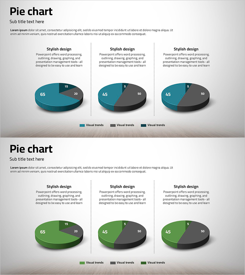
A 3D pie chart PowerPoint slide designed for market share analysis and competitive comparison. The slide features teal and charcoal gray tones with a three-segment circular graph that intuitively visualizes data proportions. The 2-slide set presents the same data from different angles, allowing flexible selection based on presentation context. Each slide includes numerical labels and a legend, making it immediately editable for professional presentations and reports.
Usage Points
-
Main Usage
Clearly express proportional relationships such as market share, competitor comparison, sales ratio, and customer composition using a 3D pie chart. The contrasting teal and charcoal colors distinguish each segment and focus audience attention on key data points.
-
How to Use
Use in executive reports, business analysis presentations, marketing strategy meetings, and investor pitch decks to effectively communicate quantitative data. The 2-slide set with identical data from different angles allows flexible selection to match your presentation flow and emphasis needs.
-
Recommended For
Recommended for executives, marketing managers, sales directors, consultants, and financial analysts who base decisions on quantitative data. Particularly useful for quarterly performance reports, market analysis, and competitive landscape presentations.
-
Slide Structure
Each slide consists of a title area, descriptive text box, and a 3-segment 3D pie chart. The pie chart is divided into three segments with proportions of 65%, 20%, and 15%, each labeled with numerical values and a legend. Both slides maintain identical data structure for consistent presentation delivery.
Related Products
-

Simple Car Presentation Diagram & Pie Chart – Optimized for Market Analysis
#Market and Competitor Analysis #Diagram #Graph
-

Pie Chart of the Development Status of the Snow Mountain Theme
#Product/Service Introduction #Market and Competitor Analysis #Diagram
-

Pie Chart of Composition Ratio by Fashion Type – The Start of Data Visualization
#Company Introduction #Market and Competitor Analysis #Diagram
-

Pie Chart for Workout Type Preferences – Market Status
#Market and Competitor Analysis #Diagram #Graph
