Pie Chart of Composition Ratio by Fashion Type – The Start of Data Visualization
RJ0500019_6
- Last Update 06/12/2025
- File Size 1.5MB
- # of Slides 2
- File Format PPTX
- Slide Ratio 16:9
- Color
Keywords
- #Content-Based Slides
- #Design-Based Slides
- #Company Introduction
- #Market and Competitor Analysis
- #Diagram
- #Graph
- #Key Achievements
- #Market Share
- #Cluster
- #Circles
- #Closed Cluster Diagram
- #Pie Chart
- #16:9
- #pie chart PowerPoint
- #3-segment pie chart
- #composition ratio presentation
- #data visualization slide
- #fashion market analysis PPT
- #percentage chart template
About the Product
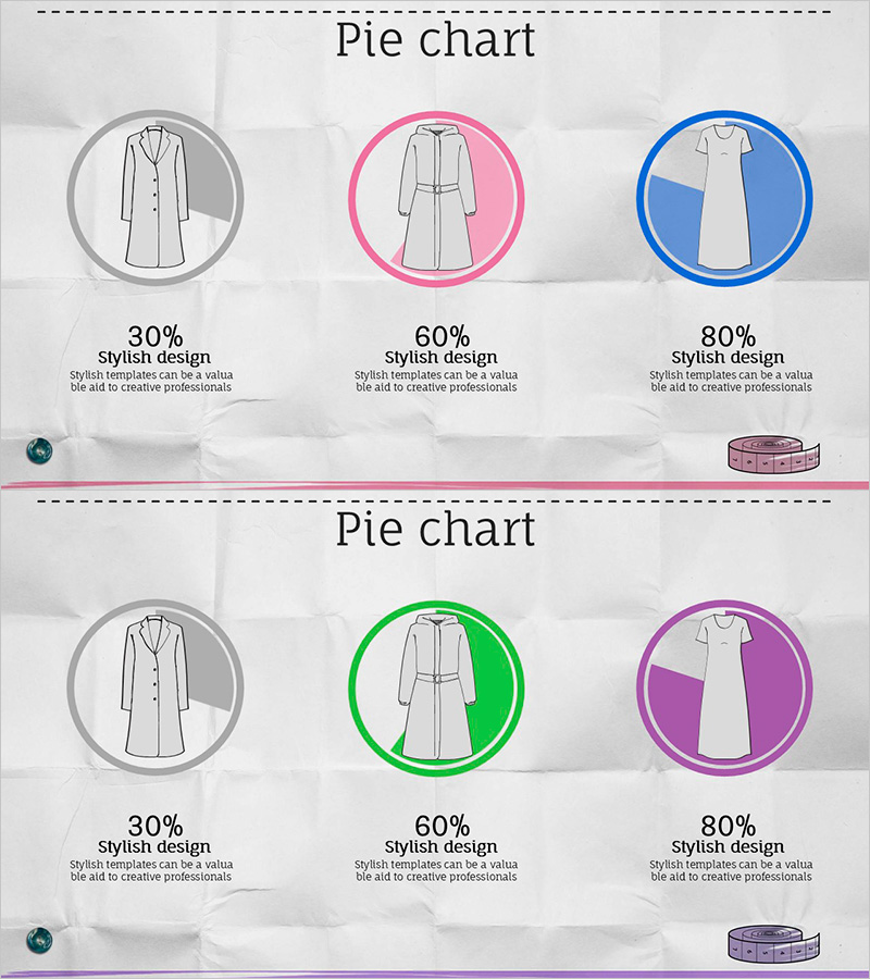
A PowerPoint pie chart slide that displays fashion industry composition ratios across three segments. The circular chart uses gray, green, and purple color schemes to clearly differentiate each category, with clothing icons embedded within the pie sections to enhance visual comprehension. The 2-slide set offers multiple color combinations, allowing you to select the version that best matches your presentation tone. Percentage values and descriptive text are displayed alongside the chart, making it immediately usable for data-driven decision-making materials.
Usage Points
-
Main Usage
Visualize quantitative data such as market analysis, performance reports, and product composition ratios using a pie chart to help audiences quickly understand proportional relationships. Applicable across fashion, retail, and all other industries requiring ratio visualization.
-
How to Use
Edit the percentage values and category labels shown on the slide to match your own data. Choose between two color combination versions to align with your presentation's brand colors and design theme.
-
Recommended For
Marketing professionals, planners, analysts, and executives explaining market share, customer composition, product sales ratios, and budget allocation. Ideal for quarterly performance reports, business plans, and investor pitch decks.
-
Slide Structure
Each slide features a title area and a 3-segment pie chart. Clothing icons are positioned within each pie section, with percentage values (30%, 60%, 80%) and 'Stylish Design' descriptive text displayed below. Both slides share identical structure with only color variations.
Related Products
-

Simple Car Presentation Diagram & Pie Chart – Optimized for Market Analysis
#Market and Competitor Analysis #Diagram #Graph
-

Market Share Comparison 3D Pie Chart – Market Insight
#Market and Competitor Analysis #Diagram #Graph
-

Sensuous Cloud Presentation Template Pie Chart1 – Visualizing Market Share
#Company Introduction #Market and Competitor Analysis #Graph
-

Market Share Donut Pie Chart – Visualization of Data Analysis
#Company Introduction #Market and Competitor Analysis #Diagram
