Graph of Car Type Analysis by Year – Market Insights
RJ0300025_15
- Last Update 04/24/2025
- File Size 0.1MB
- # of Slides 2
- File Format PPTX
- Slide Ratio 16:9
- Color
Keywords
- #Content-Based Slides
- #Design-Based Slides
- #Product/Service Introduction
- #Market and Competitor Analysis
- #Diagram
- #Graph
- #Development Status
- #Competitive Advantage
- #Cluster
- #Column
- #Closed Cluster Diagram
- #Segmented Column
- #16:9
- #100% stacked column chart PowerPoint
- #stacked bar graph template
- #year-over-year data visualization slide
- #comparative analysis chart
- #market share graph PowerPoint
- #data visualization slide template
About the Product
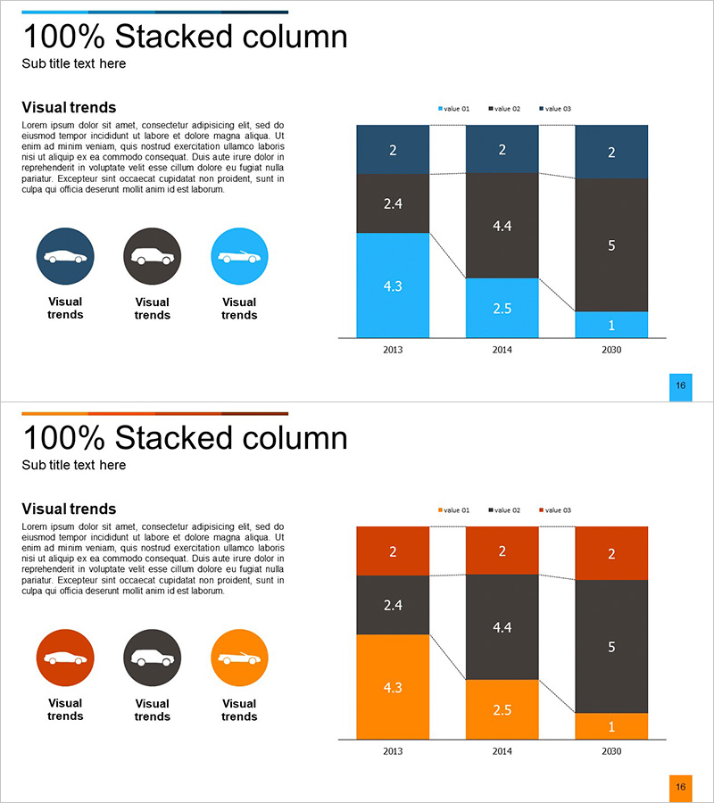
A 100% stacked column chart PowerPoint slide designed to visualize car type analysis data across multiple years. This presentation template displays three data series from 2013 to 2030 as cumulative percentages, using distinct blue, charcoal, and gray color coding to highlight each category's proportional change. The 16:9 widescreen format includes 2 slides with embedded numerical labels for precise data interpretation. Ideal for market analysis reports, business presentations, and executive dashboards requiring comparative trend visualization.
Usage Points
-
Main Usage
Visualize multi-category proportional changes over time using cumulative stacking. The 100% baseline enables direct comparison of composition shifts across years, making it ideal for market share analysis, product mix tracking, and revenue stream distribution.
-
How to Use
Insert into business reports' market analysis sections, executive presentation trend analysis pages, and marketing strategy documents. The fixed bar height with internal color ratios ensures trend clarity. Numerical labels support precise data communication without additional explanation.
-
Recommended For
Automotive, manufacturing, and retail companies tracking multi-product market dynamics. Financial analysts, marketing managers, and business intelligence professionals. Any presentation requiring quantitative year-over-year composition analysis across multiple data categories.
-
Slide Structure
Two slides featuring 3-series stacked column charts. Slide 1: blue, charcoal, gray color scheme. Slide 2: orange, charcoal, gray variant. Three year columns (2013, 2014, 2030) normalized to 100% height. Segment labels display values (2, 2.4, 4.3, 4.4, 2.5, 5, 1) for each data point.
Related Products
-

Cell Phone Development Status Analysis Chart – Competitive Advantage and Insights
#Product/Service Introduction #Market and Competitor Analysis #Diagram
-

Competitive Strengths Comparison Chart – An Effective Market Analysis Tool
#Product/Service Introduction #Market and Competitor Analysis #Diagram
-

Doughnut Chart for Logistics Performance – Analysis by Transport Method
#Product/Service Introduction #Market and Competitor Analysis #Diagram
-

Transportation Services Competitive Advantage Comparison Graph
#Product/Service Introduction #Market and Competitor Analysis #Diagram
