Doughnut Chart for Logistics Performance – Analysis by Transport Method
RJ0300043_22
- Last Update 04/29/2025
- File Size 3.1MB
- # of Slides 2
- File Format PPTX
- Slide Ratio 16:9
- Color
Keywords
- #Content-Based Slides
- #Design-Based Slides
- #Product/Service Introduction
- #Market and Competitor Analysis
- #Diagram
- #Graph
- #Development Status
- #Competitive Advantage
- #Cluster
- #Circles
- #Closed Cluster Diagram
- #Doughnut Chart
- #16:9
- #doughnut chart PowerPoint slide
- #pie chart presentation template
- #logistics performance analysis PPT
- #data visualization slide
- #transportation method comparison
About the Product
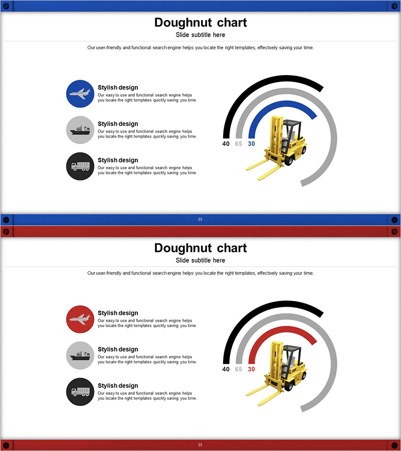
A doughnut chart PowerPoint slide designed to visualize logistics and transportation performance metrics. This 2-slide presentation features blue and red color-coded doughnut graphs that divide transportation method performance into three segments. The left side displays icons and descriptive text for each category, while the right side showcases a forklift mockup image with numerical data (40, 65, 30) prominently highlighted. This presentation template is ready to use in performance reports, business analysis decks, and executive briefings.
Usage Points
-
Main Usage
Divide and compare logistics and transportation performance indicators using a doughnut chart format. Display numerical data as circular segments to illustrate market share, performance distribution, and operational efficiency across different transportation methods at a glance.
-
How to Use
Use in logistics company performance reports, transportation method analysis presentations, and executive briefings. Customize the left-side icons and text labels for specific transportation methods (air, sea, land, etc.), and edit the doughnut chart values with your actual performance data.
-
Recommended For
Logistics and transportation managers, supply chain (SCM) professionals, business report writers, and industry analysts. Ideal for presentations requiring performance analysis, market share comparison, and operational efficiency explanations across any business sector.
-
Slide Structure
2-slide layout with consistent design. Each slide features a left panel with 3 circular icons (blue, gray, black) and descriptive text, a right panel with a doughnut chart (blue or red color scheme) and forklift mockup image, and centered numerical data (40, 65, 30) for emphasis.
Related Products
-

User Experience Advantage Analysis Chart – Visualizing Competitive Edge
#Product/Service Introduction #Market and Competitor Analysis #Diagram
-

Transportation Services Competitive Advantage Comparison Graph
#Product/Service Introduction #Market and Competitor Analysis #Diagram
-

Cell Phone Development Status Analysis Chart – Competitive Advantage and Insights
#Product/Service Introduction #Market and Competitor Analysis #Diagram
-

Investment Profit Structure Donut Chart
#Product/Service Introduction #Business Introduction #Diagram
