Transportation Services Competitive Advantage Comparison Graph
RJ0300091_25
- Last Update 05/14/2025
- File Size 3.9MB
- # of Slides 2
- File Format PPTX
- Slide Ratio 16:9
- Color
Keywords
- #Content-Based Slides
- #Design-Based Slides
- #Product/Service Introduction
- #Market and Competitor Analysis
- #Diagram
- #Graph
- #Development Status
- #Competitive Advantage
- #Cluster
- #Circles
- #Closed Cluster Diagram
- #Doughnut Chart
- #16:9
- #donut chart PowerPoint slide
- #pie chart template
- #3-layer ratio comparison
- #competitive advantage analysis chart
- #graph PowerPoint slide
About the Product
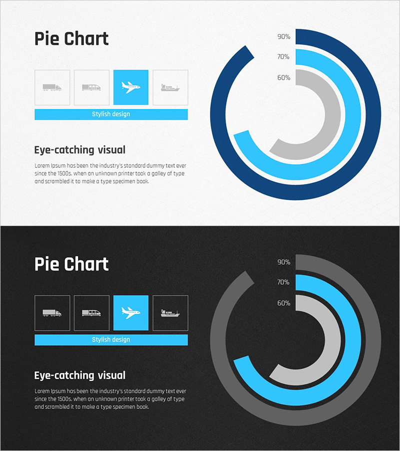
A donut chart PowerPoint slide designed to visualize competitive advantages in transportation services. The concentric ring structure uses dark blue, light blue, and gray to represent hierarchical data comparison with clarity and visual impact. Two slide versions are provided—one with a light background and one with a dark background—allowing you to adapt to different presentation environments. Each layer displays percentage values to communicate quantitative information effectively, while icon placement and text areas enable you to explain service category strengths. The 16:9 widescreen format ensures compatibility with modern presentation setups.
Usage Points
-
Main Usage
Visualize competitive positioning in transportation, logistics, and delivery services using hierarchical ratio representation. The donut structure simultaneously displays market share, service strengths, and differentiation against competitors, making it ideal for communicating competitive advantages to executives, investors, and clients.
-
How to Use
Use in market analysis and competitive analysis sections of business plans, investment pitch decks, and marketing strategy presentations. Replace percentage values with actual data and update icon areas with service category names for immediate deployment. Choose between light and dark background versions based on presentation venue lighting and screen conditions.
-
Recommended For
Ideal for transportation, logistics, delivery, and courier company executives, marketing teams, and sales professionals presenting competitive advantages. Also suitable for consulting firms, investment companies, and government agencies conducting industry analysis and policy proposals. Applicable to any data-driven business presentation requiring competitive positioning visualization.
-
Slide Structure
Two-slide set. Slide 1: Light background with 3-layer concentric donut chart in dark blue, light blue, and gray; four icons positioned on the left; percentage labels on the right. Slide 2: Identical structure with dark background for enhanced contrast. Each layer is independently editable with customizable colors, values, and text.
Related Products
-

Cell Phone Development Status Analysis Chart – Competitive Advantage and Insights
#Product/Service Introduction #Market and Competitor Analysis #Diagram
-

Doughnut Chart for Logistics Performance – Analysis by Transport Method
#Product/Service Introduction #Market and Competitor Analysis #Diagram
-

User Experience Advantage Analysis Chart – Visualizing Competitive Edge
#Product/Service Introduction #Market and Competitor Analysis #Diagram
-

Dental Caries Treatment Analysis Donut Circle Graph – A Clear Competitive Edge
#Market and Competitor Analysis #Diagram #Graph
