System Development Status Graph – Visualizing Market Share
RJ0300022_7
- Last Update 04/23/2025
- File Size 2.4MB
- # of Slides 2
- File Format PPTX
- Slide Ratio 16:9
- Color
Keywords
- #Content-Based Slides
- #Design-Based Slides
- #Product/Service Introduction
- #Market and Competitor Analysis
- #Diagram
- #Graph
- #Development Status
- #Market Share
- #Cluster
- #Circles
- #Chain Diagram
- #Doughnut Chart
- #16:9
- #doughnut chart PowerPoint
- #pie chart slide template
- #ratio comparison chart
- #multi-metric visualization
- #donut graph presentation
About the Product
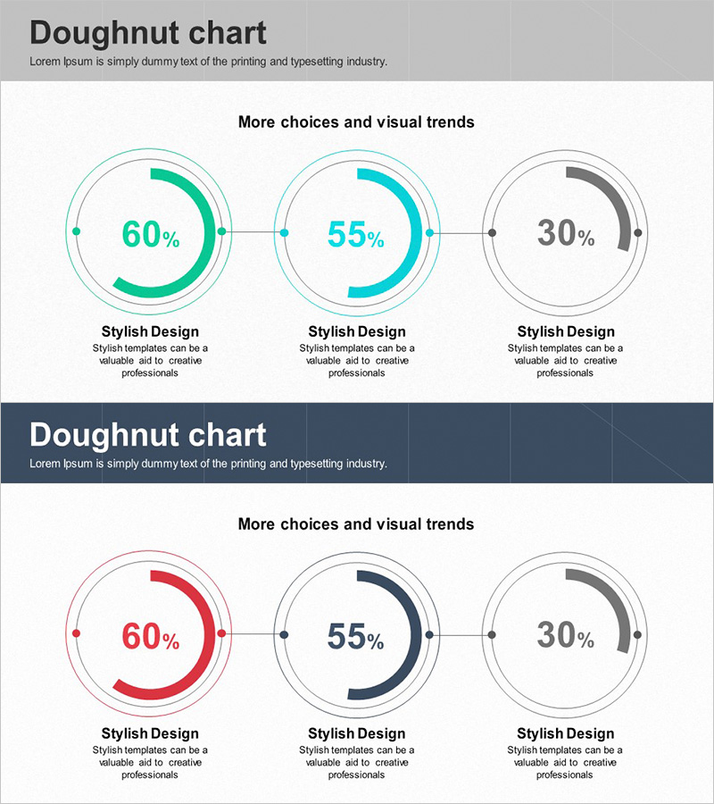
A PowerPoint slide featuring three doughnut charts arranged horizontally to visualize and compare ratios across multiple metrics such as market share, performance indicators, or preference data. The design uses a light gray background with turquoise, cyan, and dark gray doughnut rings, each displaying percentage values prominently in the center. Circular connector lines and dot elements visually link the three charts, facilitating comparative analysis. Ideal for business presentations, performance reports, and marketing analysis decks where simultaneous comparison of multiple proportional metrics is essential.
Usage Points
-
Main Usage
Simultaneously compare and visualize three or more proportional metrics. Effectively displays market share, customer satisfaction scores, sales performance, survey results, and other compositional data. The circular arrangement intuitively conveys the relative size relationships between items.
-
How to Use
Insert this slide in the analysis or results section of your presentation to explain multiple ratio-based metrics. Replace the percentage values in each doughnut center with actual data, and add item names and descriptions in the text areas below. Use the connector lines to emphasize the logical flow and relationships between the three charts.
-
Recommended For
Executive reports, marketing analysis presentations, business performance evaluations, market research findings, and financial analysis documents. Particularly effective when comparing departmental performance metrics, customer segment distribution, product category revenue share, or other multi-dimensional proportional data.
-
Slide Structure
Two-slide set with the first slide displaying three horizontally arranged doughnut charts in turquoise, cyan, and dark gray, each with centered percentage values (60%, 55%, 30%). Below each chart are 'Stylish Design' labels and description areas, connected by circular lines and dots. The second slide provides color variations (red, navy, dark gray) for flexible presentation scenarios.
Related Products
-

Status of Research and Development by Topic – Innovation and Trust
#Product/Service Introduction #Market and Competitor Analysis #Diagram
-

Aviation Service Development Schedule Donut Circle Graph
#Product/Service Introduction #Market and Competitor Analysis #Diagram
-

Development Status Analysis Connection Diagram – Effective Information Delivery
#Product/Service Introduction #Market and Competitor Analysis #Diagram
-

Development Status Donut Graph – Market Share Visualization
#Product/Service Introduction #Market and Competitor Analysis #Diagram
