Development Status Analysis Connection Diagram – Effective Information Delivery
RJ0300068_8
- Last Update 05/07/2025
- File Size 1.2MB
- # of Slides 2
- File Format PPTX
- Slide Ratio 16:9
- Color
Keywords
- #Content-Based Slides
- #Design-Based Slides
- #Product/Service Introduction
- #Market and Competitor Analysis
- #Diagram
- #Graph
- #Development Status
- #Market Share
- #Cluster
- #Circles
- #Chain Diagram
- #Doughnut Chart
- #16:9
- #doughnut chart PowerPoint
- #pie chart slide template
- #ratio analysis visualization
- #data presentation slides
- #4-item comparison chart
About the Product
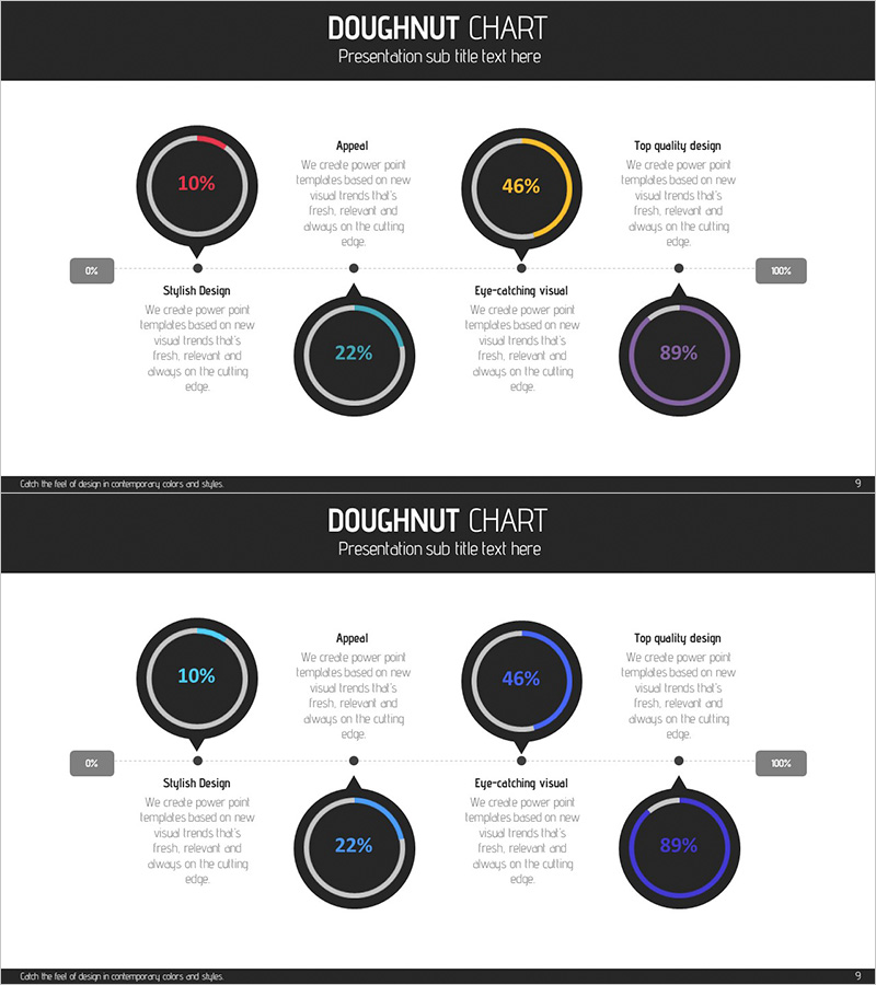
A doughnut chart PowerPoint slide that visually represents the ratio of four items with distinct color-coded rings. Set against a dark background, each chart features a colored border in red, orange, blue, or purple, with percentage values displayed in the center circle. Connected labels and descriptive text via dotted lines ensure clear information delivery. This slide deck is ideal for presenting market share, competitive analysis, development status comparisons, and other data-driven scenarios. The 2-slide set offers color variations, allowing you to select the version that best matches your presentation theme.
Usage Points
-
Main Usage
Visualize the proportional relationships of four data categories such as market share, competitive positioning, development progress, or customer satisfaction survey results. Percentage values are displayed in the center circle of each doughnut, enabling intuitive numerical comparison. Connected labels and descriptive text via dotted lines strengthen the information hierarchy and guide audience understanding.
-
How to Use
Apply this slide in business presentations, marketing proposals, performance reports, and analytical documents to represent compositional ratios. The high-contrast dark background ensures clarity in projector environments, and the 2-slide set allows you to choose color variations that align with your presentation flow and corporate branding.
-
Recommended For
Marketing professionals, business analysts, executive report presenters, management consultants, and educators delivering data-driven presentations. Particularly effective for explaining market research findings, customer segmentation, product portfolio composition, budget allocation status, and competitive landscape analysis.
-
Slide Structure
Each slide contains four doughnut charts arranged in a grid layout: top-left, top-right, bottom-left, and center positions. Each chart features a dark circular border with a colored accent ring (red, orange, blue, or purple) and displays percentage values (10%, 46%, 22%, 89%) in the center. Labels (Appeal, Top quality design, Stylish Design, Eye-catching visual) and supporting text are connected via dotted lines to create a clear visual hierarchy.
Related Products
-

System Development Status Graph – Visualizing Market Share
#Product/Service Introduction #Market and Competitor Analysis #Diagram
-

Aviation Service Development Schedule Donut Circle Graph
#Product/Service Introduction #Market and Competitor Analysis #Diagram
-

Status of Research and Development by Topic – Innovation and Trust
#Product/Service Introduction #Market and Competitor Analysis #Diagram
-

Magic Donut Chart for Market Share Visualization – Key Information Delivery
#Product/Service Introduction #Market and Competitor Analysis #Diagram
