Aviation Service Development Schedule Donut Circle Graph
RJ0300067_8
- Last Update 05/07/2025
- File Size 1MB
- # of Slides 2
- File Format PPTX
- Slide Ratio 16:9
- Color
Keywords
- #Content-Based Slides
- #Design-Based Slides
- #Product/Service Introduction
- #Market and Competitor Analysis
- #Diagram
- #Graph
- #Development Status
- #Market Share
- #Cluster
- #Circles
- #Chain Diagram
- #Doughnut Chart
- #16:9
- #donut chart PowerPoint slide
- #pie chart template
- #3-segment ratio visualization
- #market share graph
- #competitive analysis chart PowerPoint
About the Product
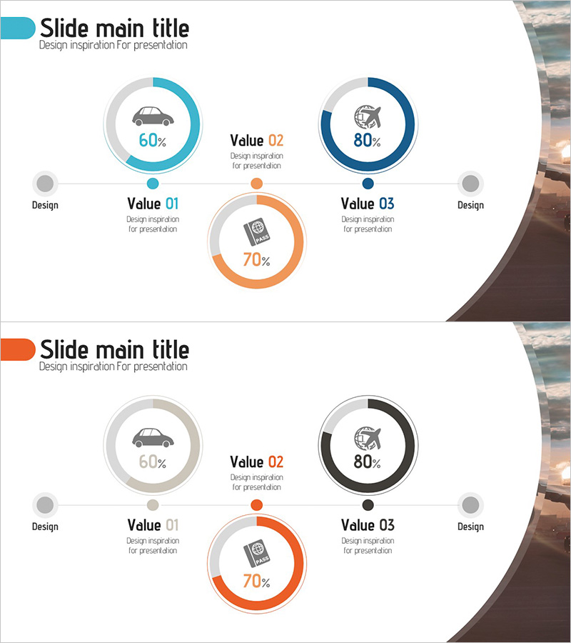
A donut chart PowerPoint slide template designed to visualize proportional data across three categories. The concentric circle structure uses cyan, orange, and black color segments to clearly distinguish data points. Each section displays percentage values and icons, making it ideal for market share analysis, competitive benchmarking, and service development timelines. The 2-slide layout adapts to various presentation contexts, with fully editable percentages and labels for quick customization.
Usage Points
-
Main Usage
Presents proportional data for three items—such as market share, competitive positioning, or development phases—in an intuitive visual format. The donut structure allows additional information to be placed in the center, enabling multi-layered data representation.
-
How to Use
Replace the percentage values and labels with your own data. The color-coded segments make it easy to distinguish between categories, and icons can be swapped to match your industry or topic for customized presentations.
-
Recommended For
Executive reports, marketing strategy presentations, business analysis documents, investor pitch decks, and consulting proposals. Particularly effective for aviation, transportation, finance, and manufacturing sectors presenting data-driven insights.
-
Slide Structure
Two-slide layout featuring identical donut chart structures with three segments (60%, 80%, 70% examples). Each segment includes icon and label areas for straightforward data entry and modification.
Related Products
-

System Development Status Graph – Visualizing Market Share
#Product/Service Introduction #Market and Competitor Analysis #Diagram
-

Development Status Donut Graph – Market Share Visualization
#Product/Service Introduction #Market and Competitor Analysis #Diagram
-

Development Status Analysis Connection Diagram – Effective Information Delivery
#Product/Service Introduction #Market and Competitor Analysis #Diagram
-

Status of Research and Development by Topic – Innovation and Trust
#Product/Service Introduction #Market and Competitor Analysis #Diagram
