Doughnut Chart for Financial Performance Visualization – Current Technology Status
RJ0200036_23
- Last Update 04/08/2025
- File Size 0.2MB
- # of Slides 2
- File Format PPTX
- Slide Ratio 16:9
- Color
Keywords
- #Content-Based Slides
- #Design-Based Slides
- #Business Introduction
- #Financial Plans and Performance
- #Diagram
- #Graph
- #Technological Status
- #Projected Return on Investment (ROI)
- #Table
- #Circles
- #Standard Table
- #Doughnut Chart
- #16:9
- #doughnut chart PowerPoint
- #pie chart slide template
- #financial performance visualization
- #multi-layer data chart
- #donut graph presentation
About the Product
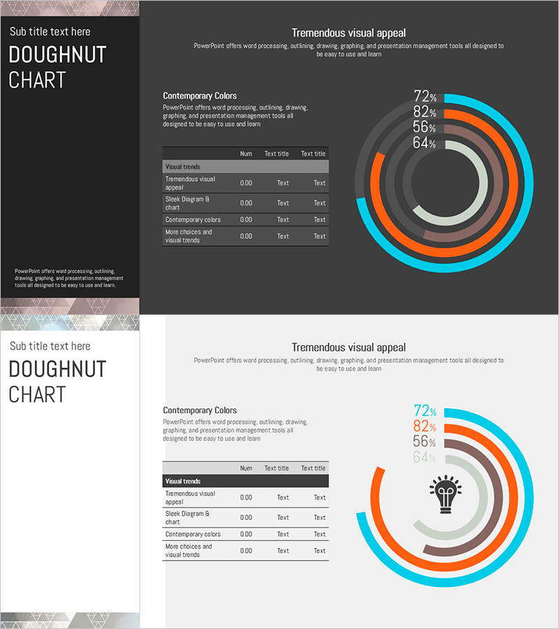
A multi-layered doughnut chart PowerPoint slide designed to visualize financial performance and technology status at a glance. The concentric ring structure uses cyan, orange, and gray tones to represent hierarchical data intuitively, with each layer accommodating numerical values and text labels. Perfect for financial plans, business reports, and technology presentations where you need to display ROI, performance metrics, budget allocation, and progress indicators. Supplied in 16:9 widescreen format with 2 slides, fully editable with customizable colors and data values for immediate use.
Usage Points
-
Main Usage
Optimized for presentations comparing multi-layered data such as financial metrics, performance figures, technology status, and budget distribution. Each concentric ring represents an independent data series, allowing you to express ROI, departmental performance, technology maturity levels, and other hierarchical information clearly.
-
How to Use
Input numerical values into each doughnut arc segment, then add item names via legend and text labels. Color coding by layer ensures clear data category distinction. Place on financial report performance sections, business plan objective achievement slides, or technology presentation status analysis pages. Easily adjust ring widths and segment percentages to match your data.
-
Recommended For
CFOs and finance managers presenting quarterly or annual performance to executives; project managers visualizing technology status and progress rates; marketing teams comparing channel or regional performance. Ideal for investor presentations, shareholder meetings, internal executive briefings, and any quantitative data-driven presentation requiring multi-dimensional comparison.
-
Slide Structure
Two-slide set: Slide 1 features a dark charcoal background with a 4-layer doughnut chart and numerical legend (72%, 82%, 56%, 64%). Slide 2 uses a light white background with the same doughnut structure plus a central lightbulb icon for visual emphasis. Both slides include title area, descriptive text section, and data table region for comprehensive information display.
Related Products
-

Paint Splash Doughnut Chart – Sensuous Visuals
#Business Introduction #Financial Plans and Performance #Diagram
-

Orange Yellow Chart Analysis – Utilizing Diagrams and Graphs
#Market and Competitor Analysis #Financial Plans and Performance #Diagram
-

Simple Circle Presentation Template Doughnut Chart – Visualizing Financial Performance
#Financial Plans and Performance #Diagram #Graph
-

Facility Capacity and Utilization Chart – Emphasizing Operational Efficiency
#Business Introduction #Operational Plan #Diagram
