Facility Capacity and Utilization Chart – Emphasizing Operational Efficiency
RB0700019_5
- Last Update 03/16/2025
- File Size 0.3MB
- # of Slides 2
- File Format PPTX
- Slide Ratio 4:3
- Color
Keywords
- #Content-Based Slides
- #Design-Based Slides
- #Business Introduction
- #Operational Plan
- #Diagram
- #Graph
- #Technological Status
- #Capital Investment Plan
- #Table
- #Circles
- #Standard Table
- #Doughnut Chart
- #4:3
- #donut chart PowerPoint slide
- #pie chart presentation template
- #operational efficiency analysis
- #facility utilization chart
- #3-segment data visualization
About the Product
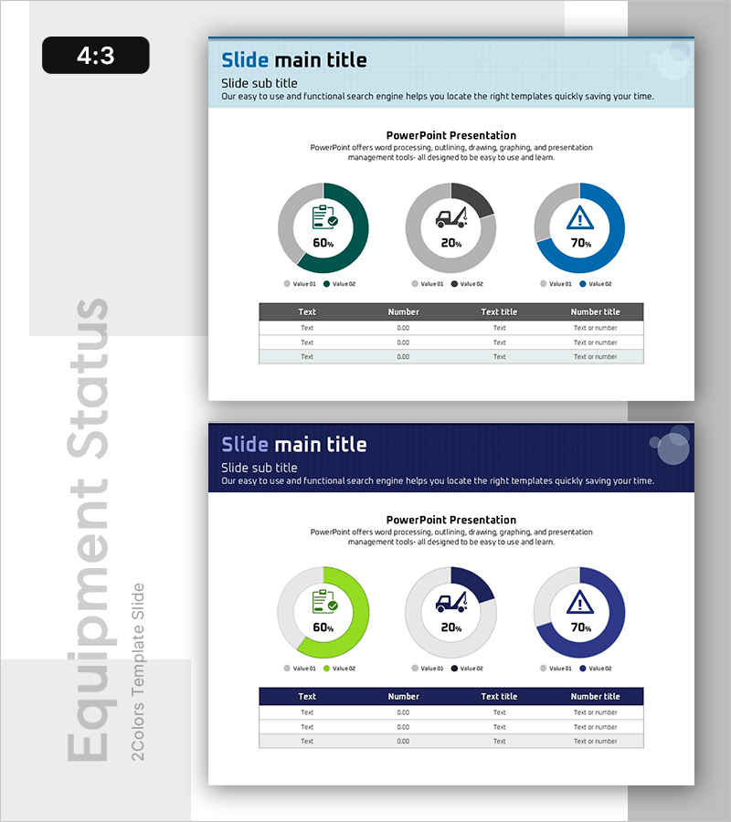
A donut chart PowerPoint slide that visualizes facility capacity and operational utilization across three key metrics. The concentric ring structure displays proportional data with embedded icons and percentage values, emphasizing operational efficiency. Light blue header contrasts with the donut segments in teal, gray, and navy tones, ensuring clear data readability. A data table below the chart provides detailed numerical context. Two color variants (light blue and dark navy backgrounds) are included, allowing flexible integration into different presentation themes and corporate color schemes.
Usage Points
-
Main Usage
Displays the proportional relationship between facility capacity, operational capability, and efficiency metrics in a single visual. The concentric donut structure enables hierarchical data representation, while embedded icons and percentage labels reinforce meaning and facilitate quick comprehension.
-
How to Use
Insert into business plans, operational reports, or management analysis presentations within facility-related sections. Edit the header title and description, replace chart values and legend labels with actual data, and populate the bottom table with detailed information. Select the color variant that matches your document's visual identity.
-
Recommended For
Facility managers in manufacturing, construction, logistics, and energy sectors; executives preparing operational efficiency reports; IR teams presenting corporate operational capacity to investors; operations directors analyzing resource utilization.
-
Slide Structure
Slide 1 (light blue background): header area + 3-segment donut chart (60%, 20%, 70% example) + legend + 4-column data table. Slide 2 (dark navy background): identical layout with alternate color scheme. 4:3 aspect ratio, PPTX format, 2 slides total.
Related Products
-

Doughnut Chart for Financial Performance Visualization – Current Technology Status
#Business Introduction #Financial Plans and Performance #Diagram
-

Big Data Development Status Analysis Graph – Visualizing Business Strategy
#Product/Service Introduction #Business Introduction #Diagram
-

Paint Splash Doughnut Chart – Sensuous Visuals
#Business Introduction #Financial Plans and Performance #Diagram
-

Pie Chart for Data Comparison – Quality and Color
#Business Introduction #Market and Competitor Analysis #Graph
