Triangular Pattern Column Chart – Visualizing Key Achievements
RJ0200036_19
- Last Update 04/08/2025
- File Size 0.2MB
- # of Slides 2
- File Format PPTX
- Slide Ratio 16:9
- Color
Keywords
About the Product
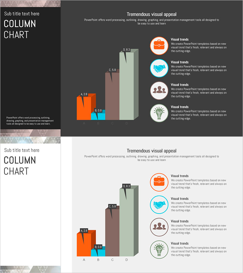
A professional column chart PowerPoint slide designed to compare and analyze key performance metrics across four categories. The slide features a vertical bar graph with four data series in orange, blue, brown, and light green, representing items A, B, C, and D with labeled values. The left side displays a triangular pattern background that adds visual depth, while the right side includes icon-based explanations for context. Data labels appear above each bar for precise numerical comparison, making it ideal for business reports and presentations. The 16:9 format with 2 slides is ready for immediate use in executive briefings and investor presentations.
Usage Points
-
Main Usage
Ideal for comparing quarterly, annual, or departmental performance metrics across four key indicators. The vertical bar structure allows viewers to instantly grasp differences in sales figures, customer satisfaction scores, market share percentages, or growth rates. Perfect for executive reports, investor presentations, and business performance announcements.
-
How to Use
Each column's height and color represent different data series, making comparisons intuitive. The triangular pattern background on the left provides visual weight and design cohesion, while the icon area on the right accommodates additional insights or explanations. Simply update the data labels with your actual figures to transform the slide into a presentation-ready asset.
-
Recommended For
Finance, operations, marketing, and sales teams presenting quarterly reviews, business plan outcomes, investment pitch decks, and consulting proposals. Recommended for presentations to executives, board members, and external stakeholders where credible data visualization is essential for decision-making.
-
Slide Structure
Two-slide layout: Slide 1 features a dark gray background with left triangular pattern zone and right chart zone; Slide 2 uses a light background with identical layout. The column chart displays four data series (A, B, C, D) as vertical bars with numeric labels above each bar. Right side includes four circular icons with accompanying text fields for explanations.
Related Products
-

Check Pattern Template for Subject Performance Visualization
#Company Introduction #Product/Service Introduction #Graph
-

Progress Doughnut Graphs for Visualizing Key Achievements – Essential for Project Management
#Company Introduction #Product/Service Introduction #Diagram
-

Four Color Infographic Template for Data Visualization Using Pie Charts
#Company Introduction #Product/Service Introduction #Graph
-

Visualizing Key Achievements with Donut Chart Slide – Company and Product/Service Introduction
#Company Introduction #Product/Service Introduction #Diagram
