Company Major Performance and Development Status Pie Chart – Blue Green
RJ0600040_13
- Last Update 07/01/2025
- File Size 0.5MB
- # of Slides 2
- File Format PPTX
- Slide Ratio 16:9
- Color
Keywords
- #Content-Based Slides
- #Design-Based Slides
- #Company Introduction
- #Product/Service Introduction
- #Graph
- #Key Achievements
- #Development Status
- #Circles
- #Pie Chart
- #16:9
- #pie chart PowerPoint slide
- #3-segment pie chart template
- #performance ratio visualization
- #company performance PPT
- #data visualization PowerPoint slide
About the Product
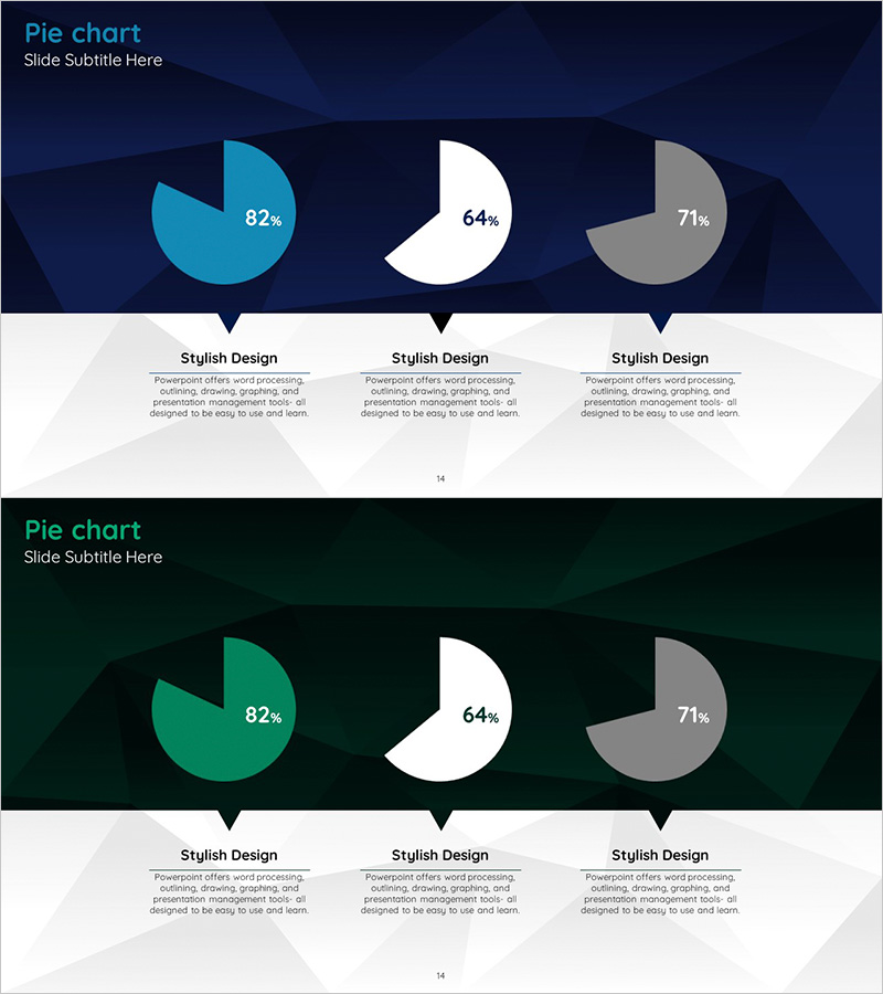
A PowerPoint slide template for comparing company performance and development status across three key metrics using pie charts. Three circular charts in cyan, white, and gray tones display percentages of 82%, 64%, and 71% against a dark blue background. Each chart is accompanied by a text description area below for detailed analysis. The 2-slide set includes identical chart layouts on contrasting dark blue and dark green backgrounds, allowing you to select the design that matches your presentation tone. All elements are fully editable in PowerPoint for customization.
Usage Points
-
Main Usage
Display and compare three key performance indicators, development metrics, or business segment ratios in a single visual. Ideal for executive reports, business briefings, and investor presentations where data credibility and quick comprehension are essential.
-
How to Use
Replace the pie chart percentages and labels with your actual company data. Update the text descriptions below each chart to explain the metrics and insights. Choose between the dark blue or dark green background slide version based on your presentation's overall design theme.
-
Recommended For
Executives, business managers, and marketing teams presenting quarterly or annual performance reviews, business status updates, and investor pitches. Perfect for company overview presentations, business plans, and management reports where quantitative metrics need emphasis.
-
Slide Structure
Each slide contains three independent pie charts arranged horizontally, each representing a single data series (82%, 64%, 71%). Below each chart is a dedicated text area for adding metric descriptions and analysis, enabling comprehensive data storytelling.
Related Products
-

Four Color Infographic Template for Data Visualization Using Pie Charts
#Company Introduction #Product/Service Introduction #Graph
-

Construction Development Status Chart – Key to Construction Market Analysis
#Product/Service Introduction #Market and Competitor Analysis #Graph
-

Development Status Analysis Circle Graph
#Product/Service Introduction #Market and Competitor Analysis #Graph
-

Hologram Donut Chart PPT for Visualizing Key Achievements
#Company Introduction #Product/Service Introduction #Graph
