Structure Presentation Visualization with Line Chart – Business Strategy Highlighting Competitive Edge
RJ0200018_16
- Last Update 04/02/2025
- File Size 2.2MB
- # of Slides 2
- File Format PPTX
- Slide Ratio 16:9
- Color
Keywords
- #Content-Based Slides
- #Design-Based Slides
- #Business Strategy
- #Market and Competitor Analysis
- #Graph
- #Financial Outlook & Expected Impact
- #Competitive Advantage
- #Line
- #Line Chart
- #16:9
- #line chart PowerPoint slide
- #dual-series trend comparison
- #data visualization template
- #market analysis chart
- #how to create line chart in PowerPoint
About the Product
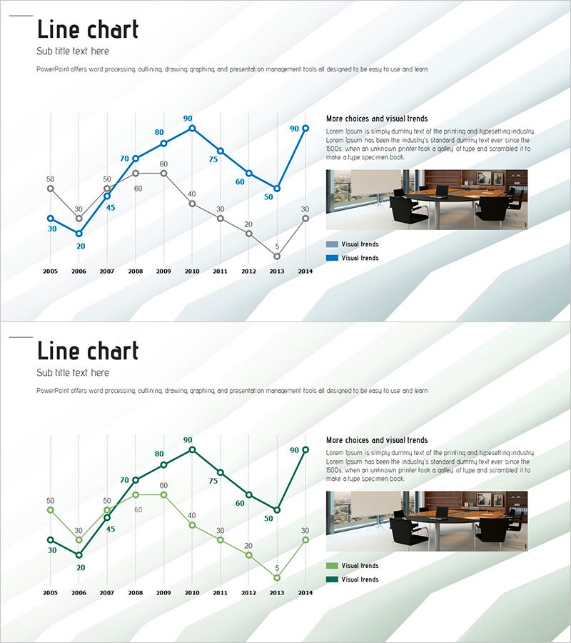
A professional PowerPoint slide featuring a dual-series line chart that visualizes data trends from 2005 to 2014. The chart uses blue and green lines to clearly distinguish between two data series, making it easy to compare trends over a 10-year period. The right side includes a photo area and text box for additional insights or commentary. This presentation template is ready to use for business strategy presentations, market analysis reports, and performance reviews where trend visualization is essential.
Usage Points
-
Main Usage
Designed to compare and analyze changes in two or more data series over time. Ideal for business performance trends, market share evolution, competitive analysis, and any presentation requiring time-based data comparison.
-
How to Use
Simply input your actual data into the line chart area on the left side of the slide, and the chart updates automatically. Add relevant images or explanatory text to the right photo area to enhance visual impact and provide context.
-
Recommended For
Executive reports, quarterly and annual performance presentations, market analysis briefings, business strategy meetings, investor presentations, and competitive intelligence reports.
-
Slide Structure
Two-slide set with identical layouts. Each slide features a dual-series line chart on the left (blue and green lines, 10 data points, grid background) paired with a photo area and text box on the right in a balanced two-column design.
Related Products
-

Blue Green Future Forecast Graph – Business Strategy and Revenue Forecast
#Business Strategy #Market and Competitor Analysis #Diagram
-

Visualizing Market Analysis with Line Chart – Securing Competitive Advantage
#Market and Competitor Analysis #Marketing Plan and Strategy #Graph
-

Wide Graph Presentation with Triangle Pattern
#Market and Competitor Analysis #Marketing Plan and Strategy #Graph
-

Colorful Bell Graph Slide – Market Status Analysis
#Market and Competitor Analysis #Graph #Market Status
