Blue Green Future Forecast Graph – Business Strategy and Revenue Forecast
RJ0900008_20
- Last Update 08/18/2025
- File Size 0.2MB
- # of Slides 2
- File Format PPTX
- Slide Ratio 16:9
- Color
Keywords
- #Content-Based Slides
- #Design-Based Slides
- #Business Strategy
- #Market and Competitor Analysis
- #Diagram
- #Graph
- #Financial Outlook & Expected Impact
- #Competitive Advantage
- #Table
- #Line
- #Line Chart
- #16:9
- #line chart PowerPoint
- #dual-series trend graph
- #data visualization slide
- #business forecast chart
- #PowerPoint template download
About the Product
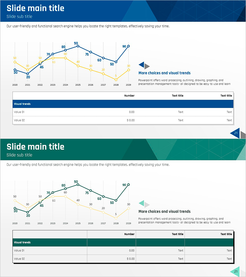
A PowerPoint slide featuring a dual-line trend chart comparing two data series from 2020 to 2029. The blue and yellow lines clearly distinguish between two metrics, with precise numerical labels at each data point for accurate information delivery. This presentation slide is ready to use for business strategy reports, revenue forecasts, market analysis, and executive presentations.
Usage Points
-
Main Usage
Compares two key metrics over time—such as annual performance, quarterly results, or market trends—to show parallel changes and correlations. Ideal for business plans, performance reports, and investor presentations where past achievements and future projections must be displayed side by side.
-
How to Use
Replace the data points and numerical labels with your actual figures. Assign the blue line to your primary metric (revenue, market share) and the yellow line to a comparison metric (costs, competitor performance) for maximum clarity.
-
Recommended For
Finance professionals, executives, and marketing teams presenting quarterly or annual performance. Also suitable for consultants and analysts explaining market trends or industry benchmarks.
-
Slide Structure
Two-line chart with 10 data points spanning 2020–2029 on the horizontal axis and a 0–90 scale on the vertical axis. Each point displays exact numerical values, with a legend and additional annotation area for context.
Related Products
-

Dawn City Theme Competitor Analysis Graph – Understanding Market Trends
#Market and Competitor Analysis #Diagram #Graph
-

Competitor Analysis Graph & Table by Year
#Market and Competitor Analysis #Diagram #Graph
-

Key Performance Analysis Graph – The Power of Data Visualization
#Company Introduction #Market and Competitor Analysis #Diagram
-

Highlighted Line Charts and Tables – Market Analysis and Revenue Forecast
#Business Strategy #Market and Competitor Analysis #Diagram
