Line Graph for Market Trends Visualization – Competitive Advantage Analysis
RJ0500005_11
- Last Update 06/08/2025
- File Size 0.2MB
- # of Slides 2
- File Format PPTX
- Slide Ratio 16:9
- Color
Keywords
About the Product
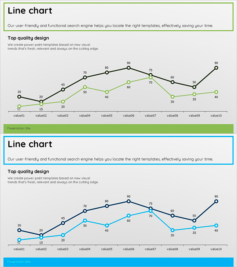
A dual-series line chart PowerPoint slide designed to visualize market trends and competitive positioning. This presentation template displays two data series across 10 data points, using contrasting green and black lines to clearly compare performance trajectories. The slide layout includes a descriptive header area and presentation title bar at the bottom, making it ready for immediate use in business reports, marketing plans, and strategic analysis presentations. Provided in 16:9 widescreen format with 2 slides in PPTX, allowing full customization of data values and color schemes.
Usage Points
-
Main Usage
Effectively communicate numerical changes over time by displaying two data series simultaneously, enabling viewers to instantly grasp relative performance and directional trends. Ideal for executive briefings, investor presentations, and strategic planning meetings where data-driven decision-making is critical.
-
How to Use
Enter your analysis topic in the title area at the top of the slide, then replace the graph data with your actual figures. Use the green line for your company's performance and the black line for competitor data, or adapt for period-by-period, regional, or product comparisons. Customize the legend and axis labels to match your presentation context.
-
Recommended For
Executive and C-suite quarterly or annual performance reviews, marketing team market analysis and competitive strategy presentations, sales team performance trend analysis, consulting firms' client diagnostic reports, and investor relations (IR) presentations explaining financial performance trajectories.
-
Slide Structure
Two-slide set: Slide 1 features a dual-series line chart with green and black lines connecting 10 data points (value01–value10), title box at top, and presentation title bar at bottom. Slide 2 offers the same structure with blue and cyan color variants for design flexibility. Numeric labels appear above each data point with gridlines for easy value reading.
Related Products
-

Blue Green Basic Line Chart – Market Status and Competitive Analysis
#Market and Competitor Analysis #Graph #Market Status
-

Colorful Bell Graph Slide – Market Status Analysis
#Market and Competitor Analysis #Graph #Market Status
-

Travel Preference Survey Slide – Market Status and Competitive Advantage
#Market and Competitor Analysis #Graph #Market Status
-

Vegetable Market Status Analysis with Line Charts
#Market and Competitor Analysis #Graph #Market Status
