Structure Presentation Template Doughnut Chart – Market Analysis and Marketing Strategy
RJ0200018_14
- Last Update 04/02/2025
- File Size 1.2MB
- # of Slides 2
- File Format PPTX
- Slide Ratio 16:9
- Color
Keywords
- #Content-Based Slides
- #Design-Based Slides
- #Market and Competitor Analysis
- #Marketing Plan and Strategy
- #Graph
- #Market Status
- #Marketing Objectives
- #Circles
- #Doughnut Chart
- #16:9
- #doughnut chart PowerPoint
- #donut graph slide template
- #3-layer data visualization
- #circular chart presentation
- #market analysis PowerPoint template
- #ratio visualization slide
About the Product
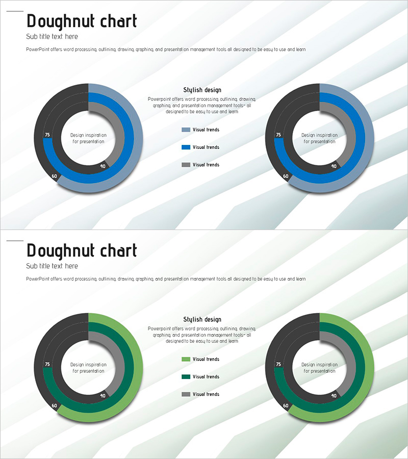
A professional doughnut chart PowerPoint slide designed for market analysis and marketing strategy presentations. This 2-slide template offers both blue and green color schemes, each featuring a 3-layer concentric circle structure for intuitive data ratio visualization. The central circular area accommodates key messages or metrics, enabling simultaneous visual emphasis and information delivery. Provided in 16:9 widescreen PPTX format, it is ready for immediate editing and integration into presentations, reports, and business materials.
Usage Points
-
Main Usage
Visualize multi-layer data such as market share, customer composition, and sales ratios using concentric doughnut circles to enhance presentation impact. Positioning key metrics or messages in the central area directs audience focus and improves information comprehension.
-
How to Use
Select the preferred color version (blue or green) from the 2-slide template and input your data. Modify numerical values in each layer to automatically update proportions, then adjust legends and labels to match your presentation context before inserting into your slides.
-
Recommended For
Marketing professionals, strategy planners, sales managers, and financial analysts benefit from this template when presenting quarterly performance analysis, market status reports, and customer segmentation strategies. Ideal for executive briefings, investor presentations, and internal meetings.
-
Slide Structure
Slide 1 (Blue version): 3 concentric circular layers with central input area, 3-item legend, and text description zone. Slide 2 (Green version): identical structure with color variation. Each layer uses distinct color intensity to clearly differentiate data hierarchies and improve visual clarity.
Related Products
-

Demand Charts in Region – A Convincing Tool for Market Analysis
#Market and Competitor Analysis #Graph #Other
-

3 Market Share Analysis – Differentiated Market Strategy
#Market and Competitor Analysis #Graph #Other
-

Donut Charts by Technology – Market Status and Competitive Advantage
#Market and Competitor Analysis #Graph #Market Status
-

Idea Presentation Template Wide – Market Analysis and Visualization
#Market and Competitor Analysis #Graph #Other
