Critical Points in the Growth Curve – Analyzed by Data
RB0800026_11
- Last Update 03/23/2025
- File Size 1.1MB
- # of Slides 2
- File Format PPTX
- Slide Ratio 4:3
- Color
Keywords
About the Product
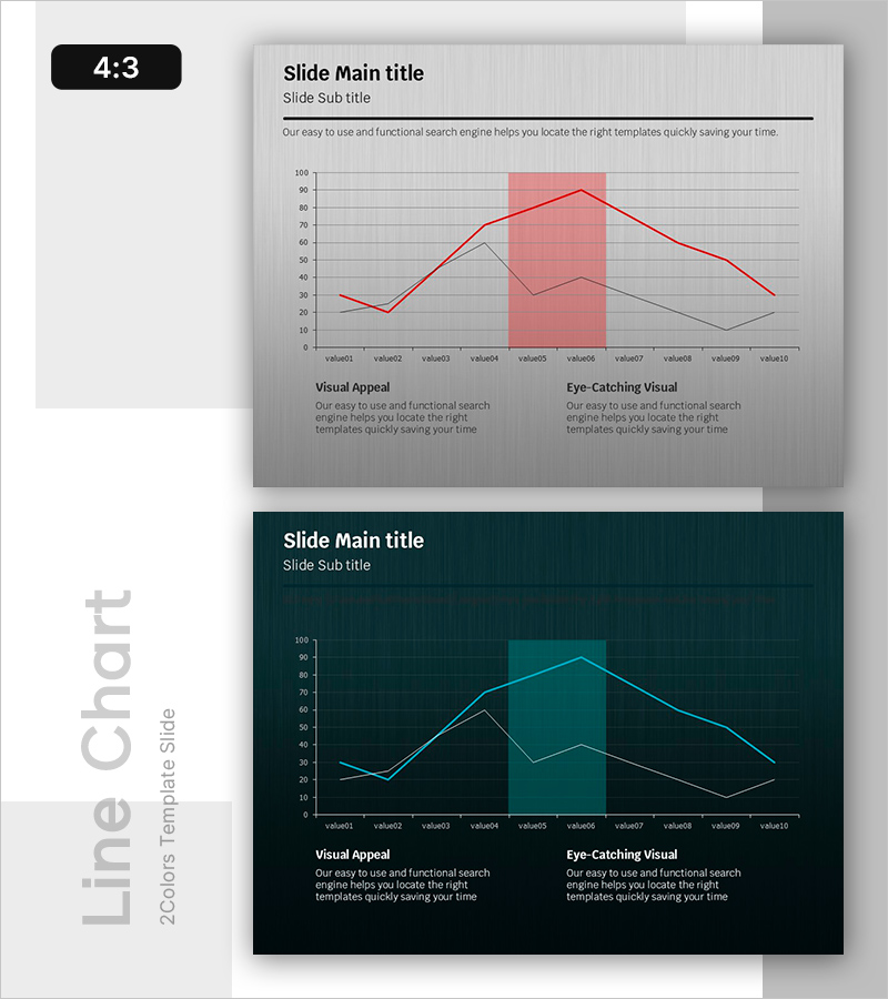
A 2-slide PowerPoint presentation visualizing growth curve data with dual-series line charts. The first slide features a light gray background with a red highlight area and two data series (red and gray lines) tracking 10 data points across 10 values. The second slide presents the same data structure on a dark teal background with cyan lines for alternative visual presentation. Both slides include two text sections at the bottom labeled 'Visual Appeal' and 'Eye-Catching Visual' for analysis commentary. The chart design clearly shows trend changes and critical points, making it ideal for business reports, marketing analysis, and performance presentations that require data-driven storytelling.
Usage Points
-
Main Usage
Visualizes time-series data comparing two metrics such as business performance, marketing KPIs, or sales trends. The highlight area emphasizes critical periods, enabling data-driven decision-making presentations. Effectively communicates quantitative insights to stakeholders through clear trend visualization.
-
How to Use
Replace Y-axis values and X-axis labels with your own data to customize immediately. Use the light gray version for bright conference rooms and projector environments; use the dark teal version for dimly lit spaces and online presentations. Adjust the highlight area color and range to emphasize key periods.
-
Recommended For
Executive reports, quarterly performance reviews, marketing campaign effectiveness analysis, financial results presentations, customer satisfaction trend tracking, and project progress monitoring. Ideal for consultants, data analysts, marketers, financial professionals, and business intelligence specialists.
-
Slide Structure
2-slide set. Slide 1: Light gray background with red highlight area, dual-series lines (red and gray), 10 data points, grid lines, and two text sections. Slide 2: Dark teal background with cyan lines, identical data points, grid lines, and matching text sections at bottom.
Related Products
-

Cell Phone Mockup Bar Graph – Market Analysis and Technology Status
#Business Introduction #Market and Competitor Analysis #Graph
-

Business Forest Wide Template Line Chart – Highlighting Financial Performance
#Financial Plans and Performance #Graph #Sales and Revenue
-

Changes in Crime Rates by Age Over Many Years – Insights from Data Analysis
#Market and Competitor Analysis #Graph #Future Outlook
-

Bar Graph for Surveying Life Satisfaction by Environment
#Market and Competitor Analysis #Graph #Market Analysis
