Contribution-Based Performance Chart – Infographic for Market Analysis
RB0100076_5
- Last Update 03/07/2025
- File Size 1.4MB
- # of Slides 2
- File Format PPTX
- Slide Ratio 4:3
- Color
Keywords
- #Content-Based Slides
- #Design-Based Slides
- #Market and Competitor Analysis
- #Graph
- #Competitor Analysis
- #Market Analysis
- #Circles
- #Doughnut Chart
- #4:3
- #donut chart PowerPoint
- #pie chart slide template
- #ratio comparison chart
- #performance analysis PPT
- #data visualization slides
- #business report charts
About the Product
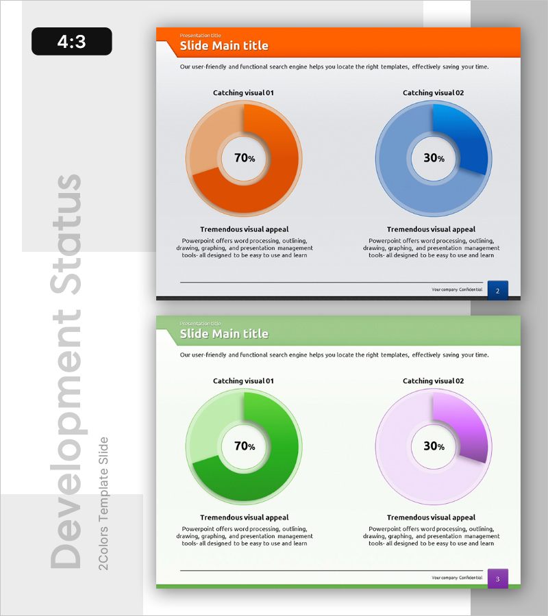
A donut chart PowerPoint slide that compares contribution and performance metrics at a glance. Featuring two color schemes—orange and blue—this circular chart template clearly displays 70% and 30% ratios with descriptive text below each section to provide data context. Designed for immediate use in business reports, market analysis presentations, and competitive benchmarking. The 4:3 aspect ratio and 2-slide format make editing straightforward and efficient.
Usage Points
-
Main Usage
Optimized for comparing contribution or performance metrics between two key indicators using ratio visualization. The donut chart intuitively represents the relationship between whole and parts, with percentages centered to emphasize numerical data.
-
How to Use
Apply in market analysis slides to show competitor market share, performance reports to display achievement rates, or business plans to illustrate revenue composition. Customize the 'Catching visual' titles and descriptive text below each donut to match your specific data and presentation context.
-
Recommended For
Marketing professionals, financial analysts, business planners, and consultants who need to visualize quantitative comparisons. Particularly suited for executive reports and investor presentations where relative proportions of two items require emphasis.
-
Slide Structure
Two-slide layout with two donut charts per slide. Left chart uses orange gradient (70%), right chart uses blue gradient (30%), creating visual distinction through color contrast. Each chart displays percentage in the center with title and description text area below, establishing clear information hierarchy.
Related Products
-

Business Market Analysis Donut Circle Chart – Visualizing Competitive Advantage
#Market and Competitor Analysis #Graph #Competitor Analysis
-

Medical Comparative Analysis Donut Circle Graph – Effective Market Analysis
#Market and Competitor Analysis #Graph #Competitor Analysis
-

Healthcare Analytics Donut Graph – Visualizing Market Insights
#Market and Competitor Analysis #Graph #Competitor Analysis
-

Blue Orange Market Analysis Donut Chart – Essence of Data Visualization
#Market and Competitor Analysis #Graph #Competitor Analysis
