Market Analysis Slide Using Donut Charts and Table
RJ0200041_18
- Last Update 04/09/2025
- File Size 0.2MB
- # of Slides 2
- File Format PPTX
- Slide Ratio 16:9
- Color
Keywords
- #Content-Based Slides
- #Design-Based Slides
- #Market and Competitor Analysis
- #Diagram
- #Graph
- #Competitor Analysis
- #Market Analysis
- #Table
- #Circles
- #Standard Table
- #Doughnut Chart
- #16:9
- #donut chart PowerPoint
- #pie chart slide template
- #market analysis presentation
- #data visualization slides
- #ratio comparison chart
- #donut graph template download
About the Product
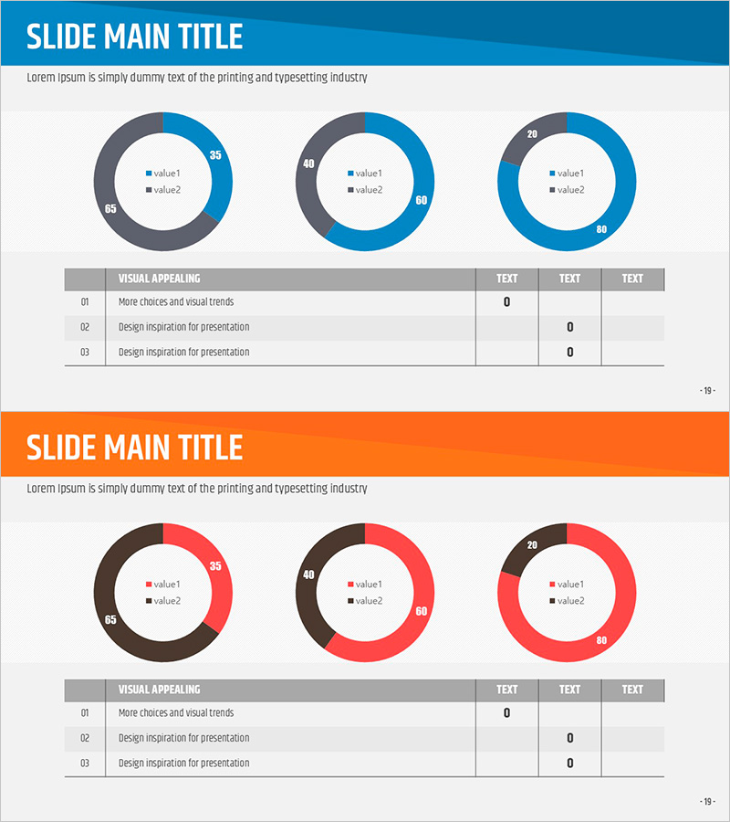
A professional donut chart PowerPoint slide designed for market analysis and competitive comparison presentations. This 2-slide template features three donut graphs on the first slide to visualize multiple data ratios, and combines a donut chart with an information table on the second slide for simultaneous visual and numerical data presentation. Created in 16:9 widescreen format with a blue-gray dual-tone color scheme and red accent colors to emphasize data importance. Each donut graph displays two data series, making it ideal for market share analysis, customer satisfaction surveys, product preference comparisons, and competitive positioning reports. All charts are fully editable in PowerPoint for instant customization.
Usage Points
-
Main Usage
Visualize two-series ratio data such as market share, competitive analysis, and customer satisfaction survey results using donut graphs. Donut charts offer an advantage over pie charts by utilizing the center space to highlight additional information or key metrics, making them ideal for professional data analysis presentations.
-
How to Use
Input actual data into the three donut graphs on the first slide to represent market share, customer preferences, or product performance comparisons. The second slide combines a donut chart with a detailed data table to present both visual and quantitative information simultaneously. Use PowerPoint's built-in chart editing tools to customize colors and values without design skills required.
-
Recommended For
Marketing professionals presenting market research findings, sales teams analyzing competitor data, executive reports requiring data visualization, consulting firms delivering analytical presentations, and academic presentations of statistical data. Particularly effective for quantitative analysis presentations with multiple comparison subjects.
-
Slide Structure
Slide 1: Three donut graphs arranged on a blue-gray background. Each donut displays two data series (value1, value2) with numerical labels. Slide 2: Single donut chart combined with information table. Table features 3 rows × 4 columns for entering detailed metrics per category. Full 16:9 widescreen format, fully editable PPTX.
Related Products
-

Visualizing Competitive Analysis with Table and 3 Donut Graphs
#Market and Competitor Analysis #Diagram #Graph
-

Contribution-Based Performance Chart – Infographic for Market Analysis
#Market and Competitor Analysis #Graph #Competitor Analysis
-

Industry Trend Analysis Donut Chart – Visual Trends Presentation
#Market and Competitor Analysis #Diagram #Graph
-

Competitor Comparison Donut Chart – Effective Tool for Market and Competitive Analysis
#Market and Competitor Analysis #Graph #Competitor Analysis
