Dividend Analysis Graph for the Last 6 Years – Financial Performance Insights
RM0600006_27
- Last Update 02/24/2025
- File Size 2.7MB
- # of Slides 2
- File Format PPTX
- Slide Ratio 16:9
- Color
Keywords
- #Content-Based Slides
- #Design-Based Slides
- #Market and Competitor Analysis
- #Financial Plans and Performance
- #Graph
- #Other
- #Competitor Analysis
- #Projected Return on Investment (ROI)
- #16:9
- #dividend analysis PowerPoint slide
- #dividend trend chart
- #financial presentation template
- #dual-axis dividend yield graph
- #how to present dividend data in PowerPoint
About the Product
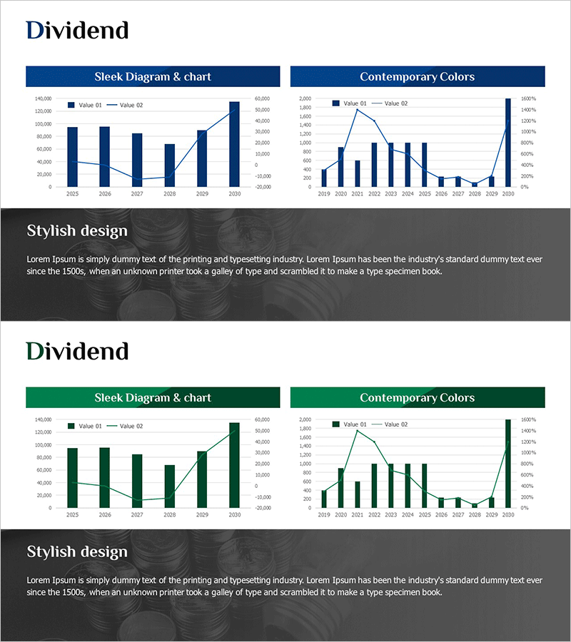
A financial PowerPoint slide analyzing dividend trends over the past 6 years (2025–2030). This presentation template combines a bar chart and line graph in a dual-axis configuration to visualize both dividend amount (Value 01) and dividend yield (Value 02) simultaneously. The dark blue header and white background maximize data readability, while the right-side 'Stylish design' section provides space for additional commentary. Ideal for investor presentations, shareholder meetings, and financial reports to effectively communicate dividend policy consistency and performance.
Usage Points
-
Main Usage
Visualize and compare dividend amount and dividend yield trends over 6 years in a single financial slide. The bar chart displays absolute values (dividend amount) while the line graph shows relative values (dividend yield), objectively demonstrating dividend policy consistency and shareholder returns.
-
How to Use
Insert into investor presentations, shareholder meetings, or quarterly/annual financial reports in the 'Dividend Policy' or 'Shareholder Returns' section. Input actual data into the left chart area and add policy explanations or future plans in the right 'Stylish design' text area to complete the slide.
-
Recommended For
CFOs, finance managers, and IR teams presenting dividend policies and performance to investors and shareholders. Particularly effective when emphasizing dividend consistency or explaining dividend yield fluctuations. Suitable for financial institutions, insurance companies, and real estate firms focused on dividend-driven business models.
-
Slide Structure
2-slide set: Left 'Sleek Diagram & chart' area contains a dual-axis chart template for two data series (Value 01 and Value 02); right 'Contemporary Colors' area provides space for additional charts or comparative data; bottom 'Stylish design' section includes text explanation area. 16:9 widescreen format optimized for projector and online presentations.
Related Products
-

Dividend Yield Comparison Analysis Chart – Visualizing Investment Performance
#Market and Competitor Analysis #Financial Plans and Performance #Graph
-

Dividend Yield & Stock Price Growth Rate Analysis Graph
#Market and Competitor Analysis #Financial Plans and Performance #Diagram
-

Dividend Analysis Chart & Dividend Policy – Insights into Market and Performance
#Market and Competitor Analysis #Financial Plans and Performance #Diagram
-

Dividend Analysis Graph - Clarifying Financial Performance
#Market and Competitor Analysis #Financial Plans and Performance #Graph
