Dividend Yield Comparison Analysis Chart – Visualizing Investment Performance
RM0600007_27
- Last Update 02/25/2025
- File Size 0.5MB
- # of Slides 2
- File Format PPTX
- Slide Ratio 16:9
- Color
Keywords
- #Content-Based Slides
- #Design-Based Slides
- #Market and Competitor Analysis
- #Financial Plans and Performance
- #Graph
- #Other
- #Competitor Analysis
- #Projected Return on Investment (ROI)
- #16:9
- #dividend yield PPT slide
- #dividend comparison analysis PowerPoint
- #investment return chart slide
- #financial performance visualization PPT
- #dividend yield comparison template
About the Product
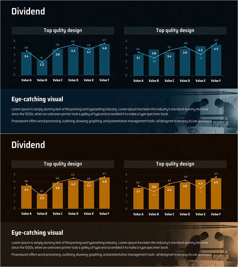
A PowerPoint slide designed to compare investment performance and dividend yields at a glance. Provided in two color versions—blue and gold tones—each featuring a left-side combination bar and line chart alongside a right-side comparison chart. Visualizes dividend data for six items (Value A through F) using both numerical values and graphical representation, enhancing investor confidence during financial presentations. Optimized for 16:9 widescreen format in PPTX, ready for immediate editing. Ideal for corporate investor relations materials, investment reports, and financial performance analysis presentations.
Usage Points
-
Main Usage
Designed to clearly communicate dividend yield trends and comparative analysis to investors during IR presentations or internal financial reports. The combination of bar and line graphs simultaneously displays absolute values and trends, serving as evidence for investment decision-making.
-
How to Use
Input actual dividend yield data into the left chart and add competitor or market average data to the right comparison chart to emphasize relative positioning. Select blue tone for trust and stability messaging, or gold tone for premium and growth positioning, depending on your corporate brand and presentation context.
-
Recommended For
Ideal for investor relations professionals, financial analysts, CFOs preparing reports, fund managers, and corporate finance teams presenting dividend policies or investment performance analysis. Particularly effective for quarterly or annual dividend trend comparisons and peer industry benchmarking materials.
-
Slide Structure
Two-slide layout with each slide featuring a left-side combination bar and line chart for six items (Value A–F) and a right-side comparison chart. Top section includes 'Top quality design' header and bottom section provides 'Eye-catching visual' description area for adding data interpretation context.
Related Products
-

Dividend Yield & Stock Price Growth Rate Analysis Graph
#Market and Competitor Analysis #Financial Plans and Performance #Diagram
-

Dividend Analysis Graph - Clarifying Financial Performance
#Market and Competitor Analysis #Financial Plans and Performance #Graph
-

Dividend Analysis Chart & Dividend Policy – Insights into Market and Performance
#Market and Competitor Analysis #Financial Plans and Performance #Diagram
-

Dividend Analysis Graph for the Last 6 Years – Financial Performance Insights
#Market and Competitor Analysis #Financial Plans and Performance #Graph
