Top Sales Analysis Graph – Visualizing Market and Performance
RM0600006_12
- Last Update 02/24/2025
- File Size 1MB
- # of Slides 2
- File Format PPTX
- Slide Ratio 16:9
- Color
Keywords
- #Content-Based Slides
- #Design-Based Slides
- #Market and Competitor Analysis
- #Financial Plans and Performance
- #Diagram
- #Graph
- #Market Analysis
- #Sales and Revenue
- #Table
- #Horizontal Bar
- #Horizontal Bar Chart
- #16:9
- #horizontal bar chart PowerPoint
- #sales analysis slide
- #data visualization template
- #bar graph presentation
- #financial report slide template
About the Product
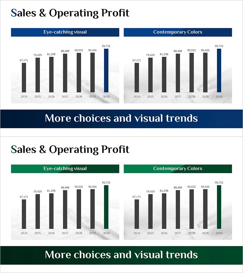
A professional PowerPoint slide featuring a horizontal bar chart comparing sales data across seven years from 2024 to 2030. The chart uses charcoal gray bars for standard years and a navy blue bar for the final year (2030) to emphasize target values or forecasts. Available in two design variations: 'Eye-catching Visual' and 'Contemporary Colors.' The 16:9 widescreen format includes two slides ready for immediate use in financial reports, business plans, and performance presentations. Each bar displays precise numerical values for clear data comparison and trend analysis.
Usage Points
-
Main Usage
Visualize time-series numerical data such as annual sales, performance metrics, or market size using a horizontal bar chart format. The navy blue highlight on the final bar draws attention to target values, forecasts, or peak performance.
-
How to Use
Insert into business plans, quarterly performance reports, or investor pitch decks in the financial or results section. Replace bar values with actual data, add legends or annotations as needed, and customize text to match your presentation context.
-
Recommended For
Finance managers, planning teams, sales leaders, and executives presenting quarterly or annual results to stakeholders, investors, or clients. Ideal for demonstrating growth trends, goal achievement rates, and market share evolution.
-
Slide Structure
Two-slide set, each containing a horizontal bar chart with seven years (2024–2030) of data. Six charcoal gray bars represent standard years, with one navy blue bar highlighting the final year. X-axis displays numerical range (0–100,000), Y-axis shows year labels, and precise values appear at the end of each bar.
Related Products
-

Sales Outlook Comparison Analysis Chart – Market Analysis and Performance
#Market and Competitor Analysis #Financial Plans and Performance #Diagram
-

Key Financial Indicators and Growth Outlook – Optimized Graphs for Investment Proposals
#Business Introduction #Market and Competitor Analysis #Diagram
-

Cement Theme Bar Graph & Table
#Market and Competitor Analysis #Diagram #Graph
-

America Map and Icon Sign – Effective Tool for Market Analysis
#Market and Competitor Analysis #Financial Plans and Performance #Diagram
