Graph of Analysis of Major Shareholder Stake - Effective Comparison
RM0600005_6
- Last Update 02/24/2025
- File Size 0.3MB
- # of Slides 2
- File Format PPTX
- Slide Ratio 16:9
- Color
Keywords
- #Content-Based Slides
- #Design-Based Slides
- #Company Introduction
- #Market and Competitor Analysis
- #Graph
- #Shareholder Structure
- #Market Status
- #Circles
- #Doughnut Chart
- #16:9
- #donut chart PowerPoint slide
- #pie chart presentation template
- #shareholder stake analysis
- #ratio visualization PPT
- #circular chart slide design
About the Product
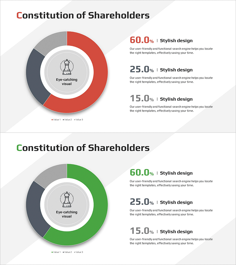
A donut-shaped pie chart PowerPoint slide designed to visualize major shareholder stake distribution. This 2-slide set features a central icon placement with three color segments—red, gray, and green—enabling clear comparison of shareholder composition ratios. Ideal for company overview presentations, investor relations materials, and quarterly reports where shareholder structure needs to be explained effectively. The slides use a 16:9 widescreen format in PPTX, allowing immediate customization of data values and labels for different stakeholder presentations.
Usage Points
-
Main Usage
Visualize shareholder composition and stake distribution using a donut-shaped pie chart to clearly communicate company ownership structure to investors and stakeholders. The central icon (chess piece) symbolizes management and key decision-makers, while the three-segment ratio allows instant comparison of ownership percentages.
-
How to Use
Apply this slide in company overview presentations' organizational structure section, quarterly and annual reports' governance sections, and investor pitch decks' shareholder overview slides. Edit the percentage values in each colored segment to reflect actual stake distribution, and pair with legend text to effectively demonstrate shareholder diversity and ownership concentration.
-
Recommended For
CFOs, investor relations managers, finance teams, and corporate communications professionals preparing shareholder presentations. Recommended for public companies, private enterprises, and startups creating investor pitch materials, shareholder meeting documents, and corporate governance disclosure presentations.
-
Slide Structure
Two-slide set featuring a donut-shaped pie chart with 60% red segment, 25% gray segment, and 15% green segment. A chess piece icon is centered within the donut. The second slide applies an alternate green-accent color scheme to highlight specific shareholder groups or emphasize particular ownership categories.
Related Products
-

Major Shareholder Analysis Chart – Effective Market and Competitive Analysis
#Company Introduction #Market and Competitor Analysis #Diagram
-

Investor Ratio Comparison Analysis Chart – Market Status and Competitive Analysis
#Company Introduction #Market and Competitor Analysis #Diagram
-

Key Shareholder Analysis One Donut Chart
#Company Introduction #Market and Competitor Analysis #Graph
-

Chart of Changes in the Ratio of Institutional and Individual Investors – Simplified Shareholder Composition
#Company Introduction #Market and Competitor Analysis #Graph
