Key Financial Metrics Analysis Donut & Bar Charts – Data Visualization
RM0600005_28
- Last Update 02/24/2025
- File Size 0.3MB
- # of Slides 2
- File Format PPTX
- Slide Ratio 16:9
- Color
Keywords
- #Content-Based Slides
- #Design-Based Slides
- #Market and Competitor Analysis
- #Financial Plans and Performance
- #Graph
- #Other
- #Market Analysis
- #Key Financial Indicators
- #Circles
- #Doughnut Chart
- #16:9
- #donut chart PowerPoint
- #pie chart PowerPoint slide
- #bar graph PPT template
- #financial metrics analysis chart
- #data visualization PowerPoint slide
- #how to create donut chart in PowerPoint
About the Product
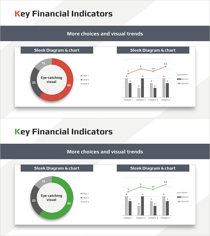
A PowerPoint template combining a donut chart and multi-series bar graph on a single slide for financial metrics analysis. The left donut chart displays three data values in red, gray, and black segments with a center text area, while the right bar graph visualizes four categories across three data series with an overlaid line chart. Optimized for 16:9 widescreen format in a 2-slide set, this presentation slide is ready for immediate use in financial reports, investor presentations, and business performance reviews. Both the donut chart and bar graph are fully editable, allowing you to input actual data values and update the visualization automatically.
Usage Points
-
Main Usage
Ideal for presenting financial ratios, sales performance, and market share alongside trend analysis. The donut chart establishes overall composition while the bar graph emphasizes temporal and departmental changes, enabling compelling data storytelling for investors, executives, and clients.
-
How to Use
Both slides feature identical layouts for consistent multi-metric presentations. Edit the donut chart values and legend, then input category names and series data into the bar graph—the charts update automatically. Color scheme (red, gray, black) can be customized to match corporate branding guidelines.
-
Recommended For
Finance teams, executives, marketing managers, consultants, and analysts presenting quarterly results, investor relations, board meetings, and client proposals. Particularly effective when communicating both proportional and trend information simultaneously.
-
Slide Structure
Slides 1 and 2 share identical layout: left donut chart (3 segments with center text input area) + right multi-series bar graph (4 categories, 3 data series, overlaid line chart). Title area at top and legend area at bottom on each slide.
Related Products
-

Regional Demand Survey Graph – Key to Market Analysis
#Market and Competitor Analysis #Financial Plans and Performance #Graph
-

Simple Car Wide Presentation Map&Donut Chart – Market Share Analysis
#Market and Competitor Analysis #Graph #Other
-

Mokup and Turnout Analysis Chart – Analyze with Visual Data
#Market and Competitor Analysis #Graph #Other
-

Doughnut Chart Slide Visualizing Market Share by Country
#Market and Competitor Analysis #Graph #Other
