Sales Outlook Analysis Segmented Graph – Visualizing Financial Performance
RM0600005_22
- Last Update 02/24/2025
- File Size 0.3MB
- # of Slides 2
- File Format PPTX
- Slide Ratio 16:9
- Color
Keywords
- #Content-Based Slides
- #Design-Based Slides
- #Financial Plans and Performance
- #Diagram
- #Graph
- #Budget
- #Sales and Revenue
- #Table
- #Horizontal Bar
- #Segmented Horizontal Bar
- #16:9
- #segmented bar chart PowerPoint
- #stacked bar graph template
- #sales analysis slide
- #financial data visualization
- #comparison chart download
About the Product
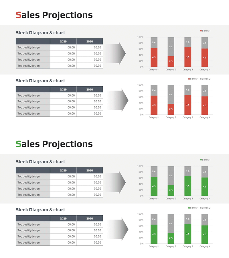
A 4-series segmented bar chart PowerPoint slide designed for sales outlook analysis and financial performance visualization. This template compares data across 2029 and 2030 for four categories, with a dual-color scheme (red and gray) distinguishing each series. Numeric labels appear above each bar segment for precise data communication. The layout pairs a source data table on the left with a corresponding chart visualization on the right, making it ideal for financial reports, business plans, and performance presentations that require clear comparative analysis.
Usage Points
-
Main Usage
Visualize year-over-year and category-by-category sales data using a 4-series segmented bar chart for financial analysis and reporting. This slide supports quantitative comparison across multiple dimensions, making it essential for business performance reviews, financial planning presentations, and marketing ROI analysis.
-
How to Use
Enter year and category-specific sales figures into the left table, and the right chart updates automatically. Maintain the red-gray color scheme or customize with corporate brand colors. Modify category labels and legend text to adapt the template for various financial datasets and reporting scenarios.
-
Recommended For
CFOs, financial analysts, business planning teams, and marketing departments presenting quarterly or annual performance reports. Ideal for investor presentations, executive briefings, and departmental performance reviews where quantitative comparison and data credibility are critical.
-
Slide Structure
2-slide set. Each slide features a 4-row, 3-column data table (left side, showing 2029 and 2030 year-over-year figures) paired with a 4-series segmented bar chart (right side, displaying 4 categories with numeric labels above each segment). Table and chart are linked for automatic data synchronization.
Related Products
-

Profit Analysis Table – Visualizing Financial Planning and Performance
#Financial Plans and Performance #Diagram #Budget
-

Production Cost Variance Analysis Chart – Visualizing Financial Performance
#Financial Plans and Performance #Diagram #Graph
-

Standard Table Slide Design – Effective Data Comparison
#Financial Plans and Performance #Diagram #Budget
-

Sales Outlook Analysis Table – Focus on Market and Financial Performance
#Market and Competitor Analysis #Financial Plans and Performance #Diagram
